New Tutorial – Create Amazing Grunge Textured Wallpaper Artwork with GoMedia Vector Packs!
Hello everyone! Today I am going to show you how to put together a pretty badass looking grungy wallpaper background without having to go nuts with brushes and filters… we’re going to use nothing but the EXTREMELY cool Go Media Arsenal Vector Packs, and some object layer styles. I’ve been seeing people use these gorgeous vector packs and we advertise them on Pixel2life.com, but I’ve never had the chance to play with them until I recently picked up Arsenal Pack 12. If you have no idea what I am talking about, a company who makes some fairly insane artwork for guys like Ozzy Osbourne, Pepsi, Metallica and a ton of other very high profile names. GoMedia also sells gorgeous artwork, templates, textures and more in their custom shop, known and the GoMedia Arsenal Shop, and one of their biggest sellers are the Vector Packs. As I write this, they currently have 13 sets, with a 14th on the way fairly soon.
If you want to check out all their packs and other design goodies, check them out at www.gomedia.us and you’ll find plenty of gorgeous artwork to drool over. The beauty of these packs is that they are all vector EPS files, so you can work with them in any graphics program, including Corel products, and I am going to show you how these packs make it so simple to create killer pieces in a matter of minutes. In fact, the piece that I did for this tutorial took about 5 minutes to make tops, it’s honestly that simple!
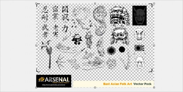
WARNING: For this tutorial, I am going to be using the Line Work 2 set and East Asian Folkart set from Pack 12, as well as Watercolor Textures 1 from their Textures series. You can see the Pack 12 as well as the other Packs by clicking HERE and you can check out the Texture Series by clicking HERE.
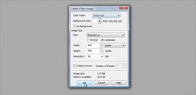
Step 1: Shall we begin? Let’s start off with an 800 x 600 pixel image, doesn’t matter what we use for a background color… I went with white:
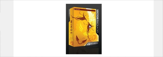
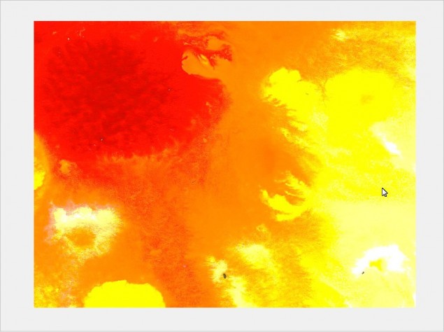
Step 2: The first thing we want to do is establish a base background, and one of the easiest ways to do this is grab an image, ANY image and slice a colorful part of it up and stretch it right out to cover the entire size of our background. For this tutorial, I’m going to just grab a thumbnail of a product box right off the GoMedia website… Looks like the Wings Set is the lucky winner:
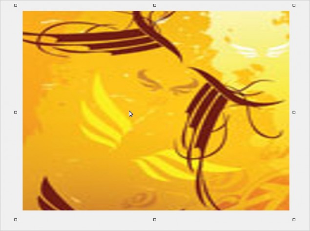
Step 3: I only want to keep the nice yellow and indian-red colored lines, so I’ll just use the rectangle mask tool and cut away the extra bits I don’t want from the sides, top and bottom… once I’m done chopping that all off, I’m left with a nice little image ready for a good stretch:
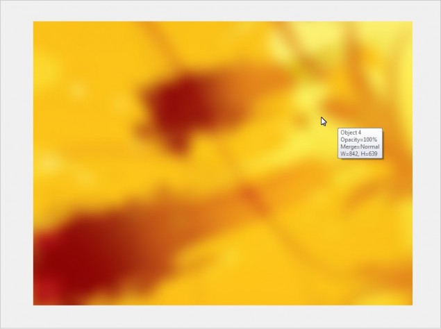
Step 4: Now all I do is drag the transform points on the object (Those little squares on each corner and the sides of the object) until my background is completely covered, and then I’ll go ahead and blue it to soften up the lines and distortion. I went with a 25 pixel gaussian blur on this one:
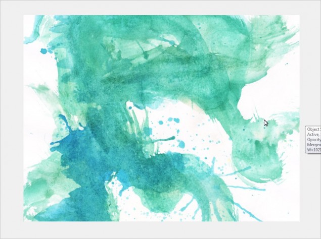
Step 5: ALRIIIIIIIIIIIIIIIIIIIIIGHTY THEN! The foundation of our background is in place, it’s time to start adding some textures and make some magic! Let’s start with some watercolor textures from the GoMedia Watercolor Textures pack, starting with a nice blue and green one. I just paste this right over top of my yellow background and resized it until I found a look I liked:
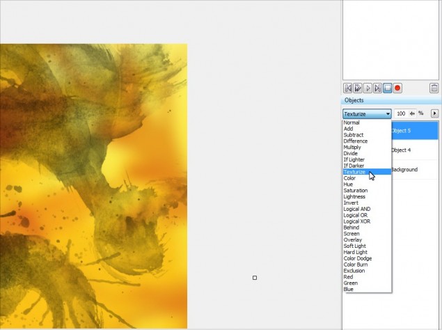
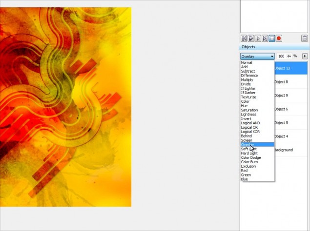
Step 6: Now comes the fun part… clik on the object in the object docker and then start scrolling through the object layer styles and you’ll find all kinds of cool looking effects with the click of a single button! It’s amazing how much easier you can create really sweet digital artwork like wallpapers and collages by simply learning to fiddle around with the layer styles. So with this watercolor texture, I decided to go with the Texturize style:
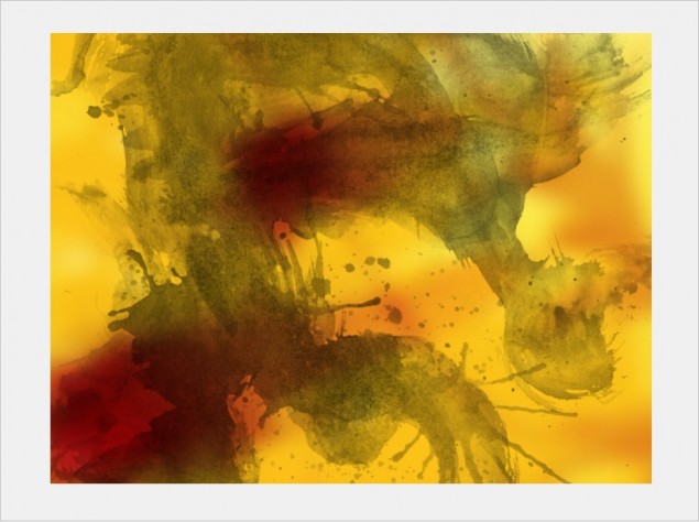
Here’s how it looks:
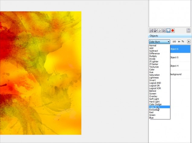
Step 7: Next up I want to add more dramatic coloration to the piece, something like bright blood red or a similar tone… I found this sweet watercolor texture and pasted it right on top:
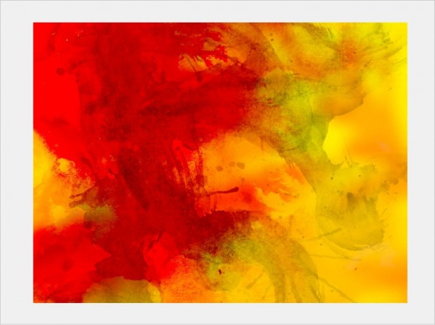
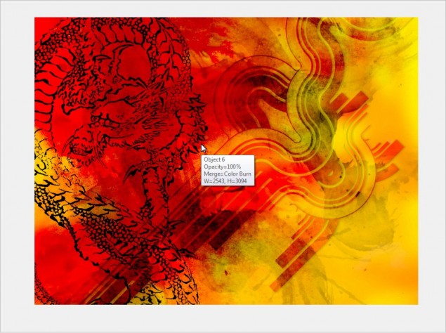
Step 8: Once again I played around with the layer styles for this texture and found that the Color Burn style looked really cool:
This is starting to look pretty cool… see how easy this is?!
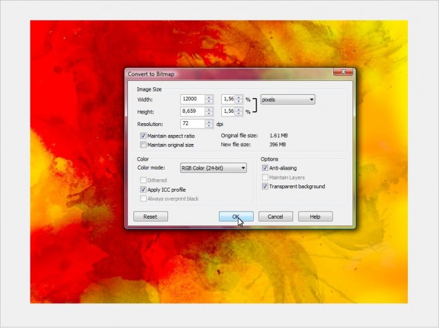
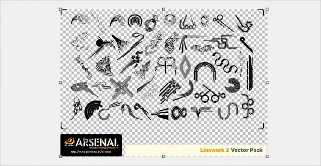
Step 9: OK, time to get down to serious business, let’s start working with the GoMedia Vector Packs… when you purchase one of these packs, each set is actually an EPS image file, so you will need to import this in to Photopaint and tell the program how big you want the images to be. Photopaint is not a vector application, so it needs to convert the EPS to a raster graphic. I’m going to start with the Line Work 2 set, so I go ahead and open the file with Photopaint and I am presented with the following box:
Step 10: The default size is way too small, so I always boost up the size of the image… for large wallpapers the like, I go with 10,000 – 12,000 pixels wide at least. It depends on how many images are in the pack, so you have to mess around until you find a size that is the correct size for you to work in. Remember it’s always better to have an image that’s too big, rather than not big enough! So let’s go with 12,000 pixels and click OK. The EPS file will now open and you will see all the images that are in the set on an object layer separate from the background:
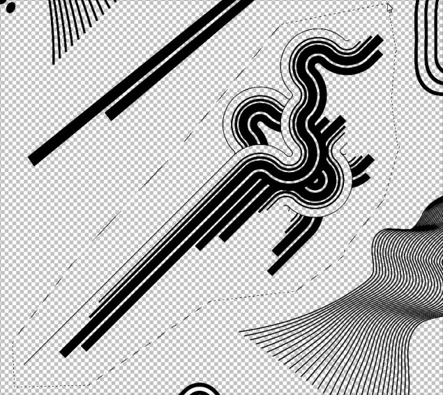
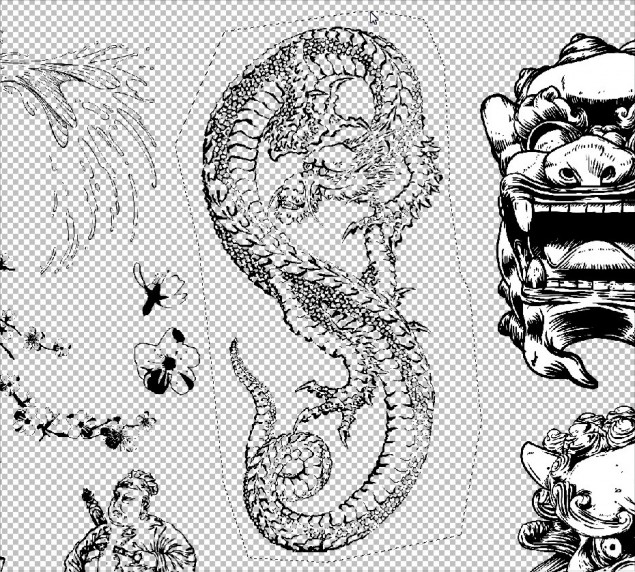
Step 11: I’ll go ahead and zoom in a bit and select one of the images in the set that I want to use in my wallpaper. You can use a masking tool to select the image you want, in this case I’ll mask off this nifty shape using the Freehand Mask Tool:
Step 12: Once I have it masked off, I simply hit Ctrl-C to copy the selection to clipboard, go back to my wallpaper project and paste it using Ctrl-V in to my project:
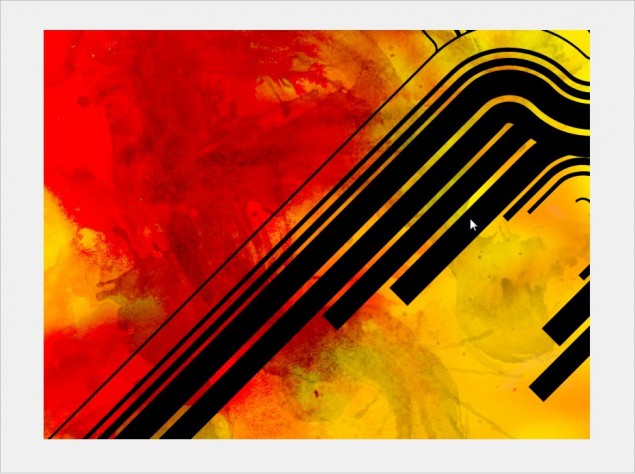
Step 13: It’s a tad too huge, so I’ll go ahead and resize it until it fits in nicely:
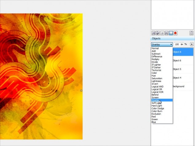
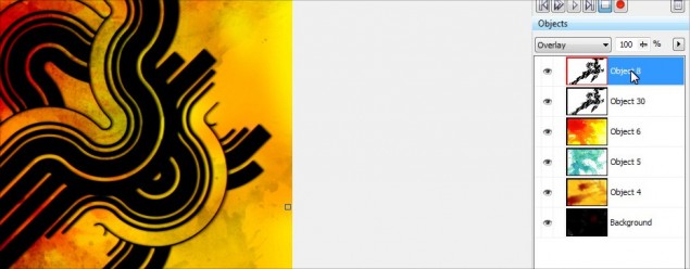
Step 14: Once again, we can play with the object layer styles to find a cool effect to apply to our nifty little line shape… in this case, I decided to go with Overlay, it blends in very nicely with the rest of the textures:
Step 15: I’ll go ahead and add a little drop shadow to the shape we added, just to make it pop out a little bit more and add a slight 3Dish element to the wallpaper. It’s a little tricky with layer styles though because you can’t just shove a blurred dark shape under the object that you want to have the drop shadow on due to the fact that the layer style is forcing the object to interact with whatever is under it. To correct this problem, we’ll need to mask off the shadow layer at cut away anything that isn’t part of our “shadow”. You’ll see exactly what I mean in the next few steps, it’s not really that hard to understand once you see what I am talking about.
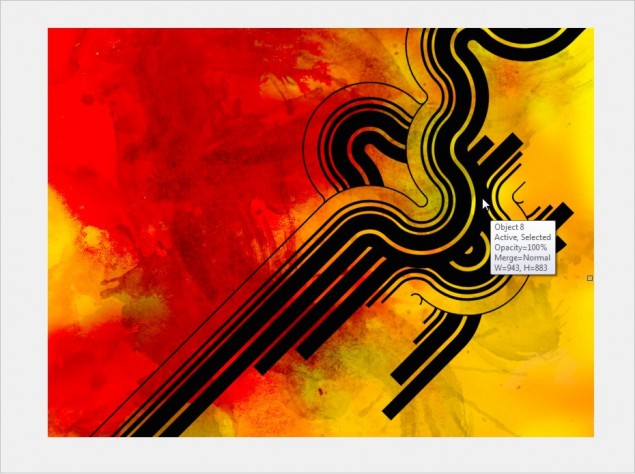
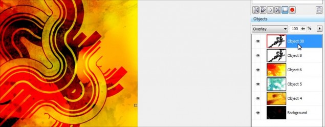
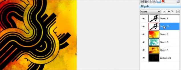
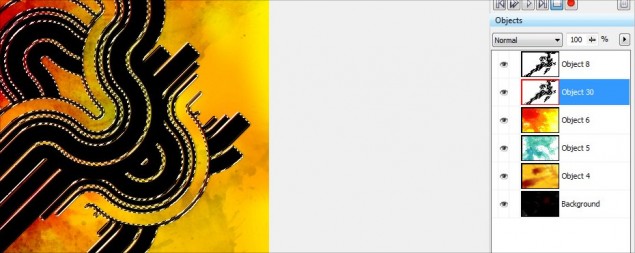
Start off by copy/pasting an additional copy of our line object… just click on the line object, hit Ctrl-C and then Ctrl-V and you will now have 2 copies in your object docker like this:
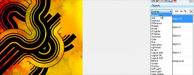
Step 16: So if we look at the object docker, Object 30 will be our “shadow” object and Object 8 is our original line shape that has the nice overlay effect. The first thing we need to do is change Object 30’s layer style to Normal instead of Overlay, so go ahead and click on Object 30 in the docker and then set the layer style to Normal:
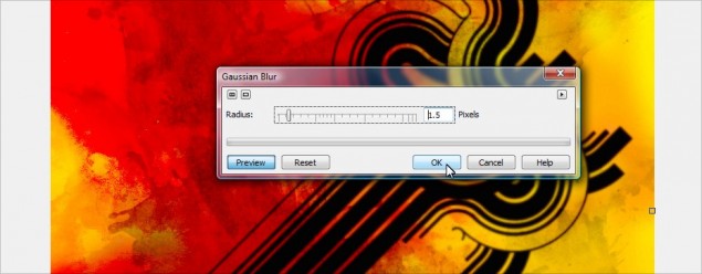
Step 17: Next up, apply a Guassian Blur effect to the shadow object layer, I’ll go with a 1.5 pixel spread (The bigger the image, the bigger you should blur it):
Step 18: We’ll need to move the shadow a bit so it shows up inder the main line image, so just click on it and move it over a couple of pixels and I will then drag the shadow object under the main line graphic object. You’ll notice that when you do this, you no longer have that cool overlay effect, all you see is the black shadow. This is why you have to mask off the shadow and cut away the part you don’t want… the overlay is making the top object blend with the black shadow object under it instead of the red and yellow background.
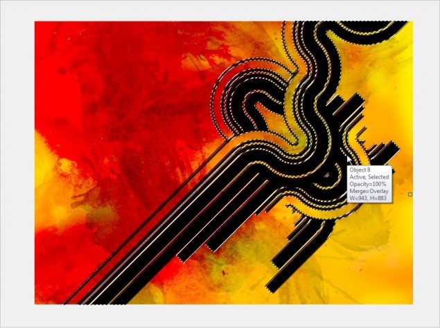
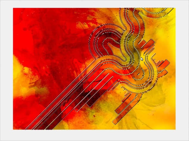
Step 19:OK, with that all in place, we now need to mask off the parts of the shadow that shouldn’t be visible, and we’re going to use the main overlay object as our stencil. So click on the overlay object and then hit Ctrl-M to generate a mask from it like this:
Step 20: Once the mask is created, you need to click on the shadow object in the docker:
Step 21: And now simply hit delete and VOILA! The extra area of the black shadow is gone and you now have a nice little shadow under your Overlat object:
WARNING: Make sure when you hit delete that you currently have a mask tool such as the rectangle mask tool as your current tool type, not the object picker. If you do not have a mask type tool currently selected, the entire shadow layer will delete, rather than just the area you have masked off!
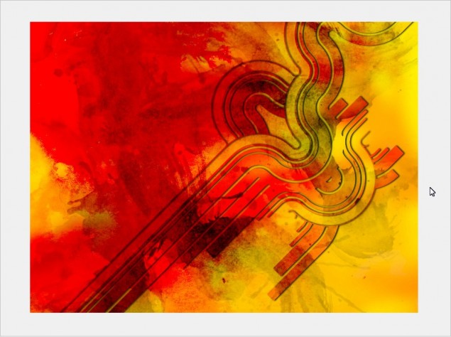
Step 22: Hit the remove mask button or Ctrl-R and here’s how it looks:
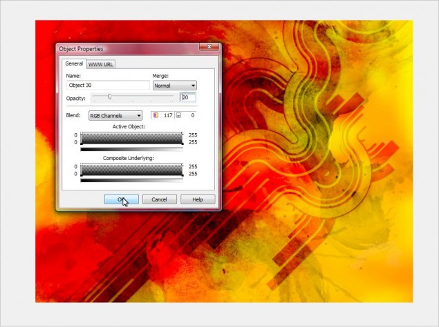
Step 23: It looks cool, but I find the shadow is too prominent, so I’ll lower the opacity to give it a more subtle effect:
Step 24: OK, now with that all done, let’s add more symbols to the background… I’ll go ahead and open the EPS for the East Asian Folkart set and import it at 12000 pixels wide again… I’ll zoom in and pick a symbol, in this case a sweet looking dragon. Repeat the same steps as last time, mask it off and copy/paste it in to our project.
Step 25: Once again, play with your layer styles for the dragon and find something you like… I like the Overlay again, so we’ll go with that:
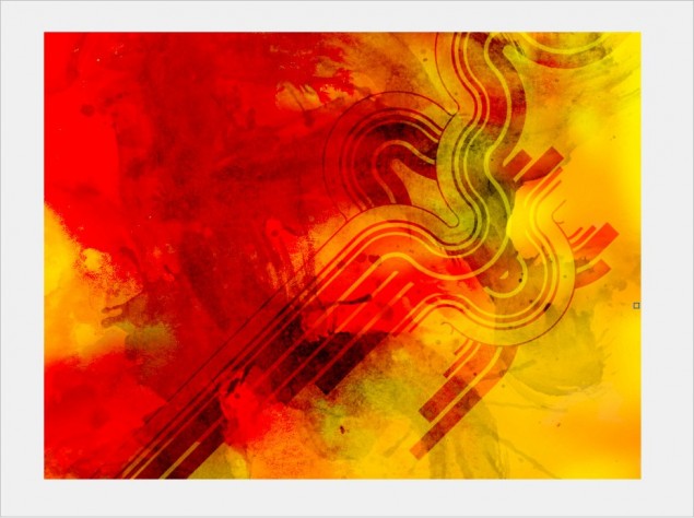
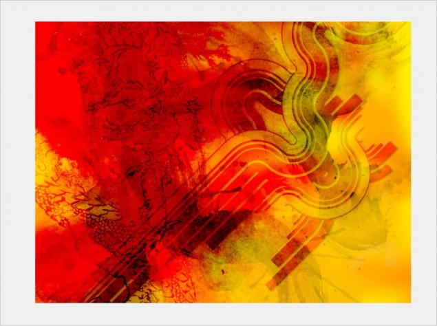
And here’s how it looks now:
Aaaaand we’re done!
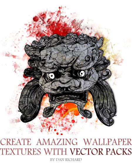
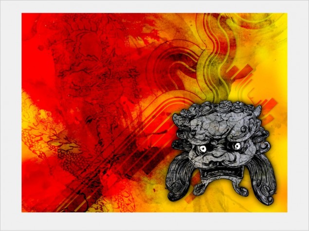
At this point, I really love the background and I think it’s time to start adding our foreground elements, or just leave it as is! I went back in to my East Asian Folkart set and grabbed a cool looking idol object and worked that in to my drawing. I basically colored it a bit and added some stone and crack textures. You can see how that’s done by reading my cracked rock texture tutorial located HERE.
Here’s what I came up with after a few minutes:
So that concludes this tutorial on using GoMedia Vector and Texture packs to create awesome designs in minutes with Corel Photopaint. If you want to pick up some of these packs to try them out, they are VERY reasonably priced so anyone can afford them and you can scope them all out on the GoMedia Arsenal page by clicking HERE!
Please use the functions below to share and comment this tutorial!
Dan
