Browsed by
Tag: Text Effect

Creating Cracked Rock Text, Faces, Orbs and other objects in Corel Photopaint!

Creating Cracked Rock Text, Faces, Orbs and other objects in Corel Photopaint!

Welcome to another Corel Photopaint tutorial by yours truly, and today we’re going to show you a VERY cool effect that is a breeze to pull off.  I’m going to show you how to apply a cracks to text, photos and other objects by using a simply texture and some layer blending.  This is easy as pie, but can be used to create some fairly complicated photo manipulations.  This is especially popular for people that like making those dark zombie style photo manipulation projects, but this is also great for creating rock text and other fun effects.

What you need to know

This is probably my 20th Photopaint tutorial, so I think the need to describe and illustrate each and every click is becoming a bit redundant don’t you think?  From now on I’ll gloss over items we’ve already discussed in great detail and dedicate the time on areas we haven’t explored together.  What I will do though, is mention what other tutorials you should know before-hand as the lessons taught on those tutorials are applicable to the current lesson.

In this tutorial, we’ll be adding some gradient style text effects with the Interactive Transparency Tool and creating a simple reflection effect, so if you’re not familiar with how to do this, please read my tutorial on creating the Sheen Text Effect. This tutorial covers these tricks in greater detail.

With that said, let’s get started!

Step 1: Our first step will be to open up Photopaint and create a new canvas with a black background.  I find the cracks stand out better on a black background, but nothing is stopping you from applying this to a white one either.  So let’s go with a black background and write out some dark grey text:

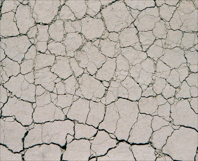
Step 2: Now go find yourself a nice photo of cracks!  NO not THAT kind of crack.. *shakes head*  This Kind!  Once you find a texture you want to work with, go ahead and paste it right over top of the text we created in Photopaint:

Here is the texture I used:

And here it is copied in to my project:

Step 3: And now we start the magic!  Change the object layer that contains the texture to Overlay and this will apply an overlay blending mode of this object layer to the object layer below it:

Ta-Da!

Now theoretically, you could save your text now and call it a day, but that’s more than a little boring, I think we need to jazz up this effect a bit more and make it grittier and just more interesting overall.  The first thing we need to do before we play is crop out the part of the texture image that we don’t need.

Step 4: Make sure you click on the text object layer on the object docker and hit Ctrl-M to generate a mask around the text:

Now click on the texture object layer and select the mask tool:

Now hit Ctrl-X (You’ll suddenly see your original grey text) and then Ctrl-V (and your cracks are back!).  You just did a cut and paste function…  At first it will appear that nothing has really changed:

But if you look at your Object Docker, you’ll see that crack text part is now in a new layer and is separate from the main texture image you started off with:

Now just click on the main texture object layer and delete it, you don’t need it anymore:

WARNING: At this point, our overlay layer is gone and you can choose to re-apply it to the object layer that has the cracked tex, or you can leave it normal.  You might be asking what the difference is… if you set the layer to Overlay, any textures or details on the layer below it will be blended with the top layer.  This is what you HAVE to do when applying the cracks to a photo.  But in this example, the grey text layer is completely solid so we don’t need to re-apply the overlay.

Step 5: Now combine the two text object layers and you are now ready to add some highlights to the text!

Step 6: Ok first off, we’ll add some dark gradient to our text.. so go ahead and do a copy/paste of the text and darken it up, and make a gradient from it.  If you don’t know how to do this, I recommment you read this tutorial, which covers the procedure of creating gradient text in detail.

Dark layer:

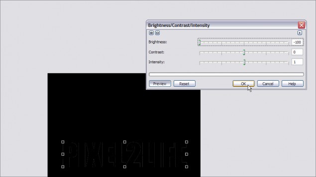
Step 7: Now you can go with that or add some dark shadows to the bottom of the text… this is a bit different to how I normally do this, so lets go a bit in detail on how it’s done.  First, create a duplicate of the text and decrease it’s brightness 100% so that the text is solid black:

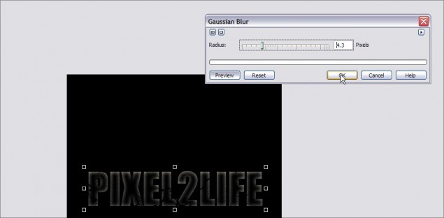
Now go ahead and apply a Gaussian Blur effect to the text… a pixel radius of about 4 should do it:

Use the Interactive Transparency Tool to add the gradient fade to the blurred shadow:

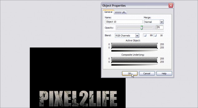
And finally, open up the objet’s properties window and adjust the opacity to tone it down a bit:

And there you have it!

Step 7: In this next step, I’ll show you how to brush on some effects to your text and have it only apply to the text instead of the entire canvas.  In this case, we’ll add a splatter of blood to the text.  You start off by combining all the text layers together in to a single object layer, then hit Ctrl-M to add a mask around the next like this:

Now grab a blood splatter brush, choose your color and opacity and add a bit of good ol’ violence to your text!

PRO TIP: You can download a blood splatter nib set from my blog site at www.danrichard.com!

Add a bit more to the other corner:

Step 8: Now just add a little reflection (You can read my tutorial on reflections here) and you are done!

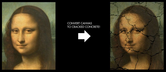
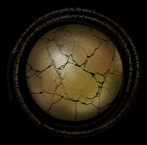
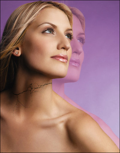
Now those of you may be wondering why I said it could be applied to text, objects, photos etc… when so far all I did was text.  Well, because if you experiment with various layer styles, you can use this exact same technique to add cracks and other textures to anything you want!  Here are some additional images I applied the exact same trick to, along with what they looked like before:


That’s it for this one, thanks for reading and I hope you enjoyed!  Remember to post a comment or use the buttons below to share.

Thanks,
Dan
Blended Text Tutorial – Create Text that Blends into your Sig’s Background in Photopaint

Blended Text Tutorial – Create Text that Blends into your Sig’s Background in Photopaint

We’ve all seen the tutorials all over the place on how to blend text into the grunge or 3d render background of sigs in Photoshop. This style is extremely popular these days and looks great for pretty much any kind of background. In fact, to emphasize this point, I’ve randomly selected a background from one of the tutorials in the P2L index to show you how this can be done with any image in Corel photopaint!

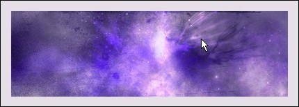
For this tutorial, I’m going to use the background effect in this Photoshop signature tutorial titled Star Explosion – Create this interesting Exploding Star / Nebula effect. Here’s what it looks like.

Here’s how to add your blended text:

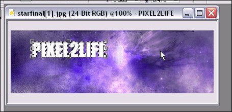
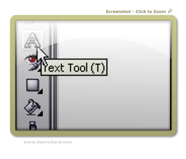
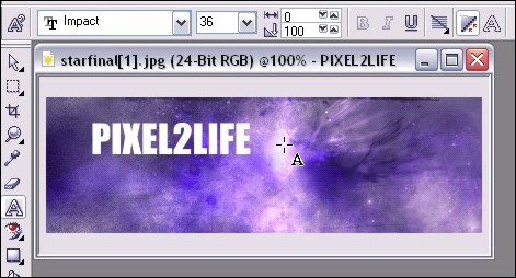
Step 1: With your image open in PhotoPaint, select the Text tool (Type ‘T’) and add some text with decent width and size.  Don’t make your text too tacky by going HUGE, but keep it a good size so the effect comes out properly.  If your text is too thin, the effect is lost somewhat.

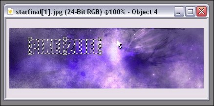
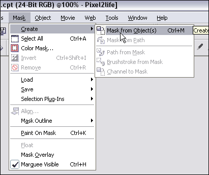
Step 2: Once you’ve completed your text, create a mask from the text (Mask from Object) by hitting ‘Ctrl-M’ and this will form a mask around your text.

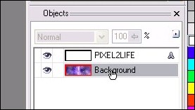
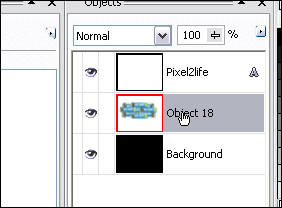
Step 3: In your object docker, select the background by clicking on it once or simply click on the background itself with the Object pick Tool (hit ‘O’).  This will ensure that the next steps will apply to the background rather than the text object.

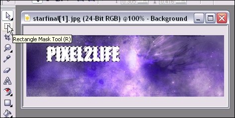
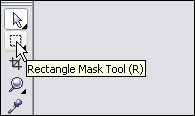
Step 4: Select the Rectangle Mask Tool by hitting ‘R’ – this will then tell PhotoPaint that any further steps will be applied to whatever is within the mask on the current object rather than the entire object currently selected, which is the background at the moment.

Step 5: Now you need to run a quick copy paste… you can either hit the copy icon, then the past icon, or use the hotkeys, which are ‘Ctrl-C’ then ‘Ctrl-V’.  This will make a copy of your text, but using the background, and it will become your top object.

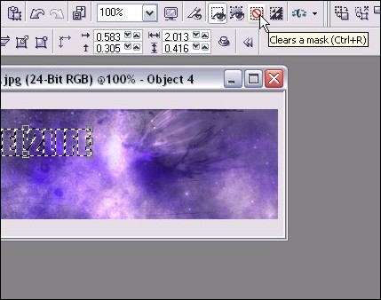
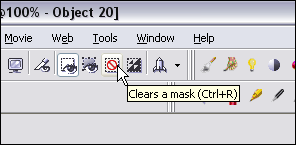
Step 6: Clear the mask by hitting ‘Ctrl-R’ or clicking the Clear Mask Icon.  One the mask is cleared, any additional steps will apply to the entire object rather than just what’s within the mask.

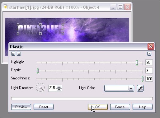
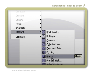
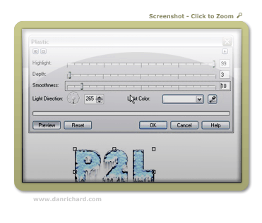
Step 7: Time to start playing with effects to bring out the text from the background.  We want it to be blended, not completely invisible!  To start, we’ll apply a plastic texture effect to our new object by clicking Effects > Texture > Plastic from the main menu.  Here are the settings I used for this tutorial, but feel free to play around.  You can really achieve a variety of blending strength by playing with the depth and highlight settings.

I have previews turned on so you can see what the effect looks like before actually applying it.

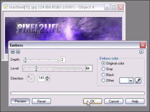
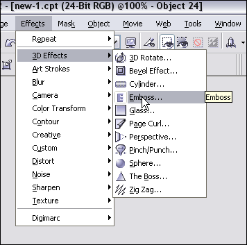
Step 8: We’ll want to add a slight Emboss to give the text a nice subtle 3D enhancement with shading.  You can do this by clicking on Effects > 3D Effects > Emboss from the main menu.  Here are the settings I used, but again, play around until you find something you like:

Step 9: At this point, let’s not forget we have the original text that we typed out in Step 1!  We’re going to use that text to add a subtle dropshadow to our text.  This will help bring out the text just a tad more to ensure it’s at least readable.  This is especially effective if the text is a bit slimmer.

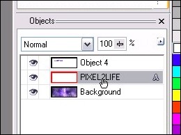
So once again go to your object docker (If you don’t have your object docker open, you can do so by clicking on Windows > Dockers > Objects on the main menu.  You still won’t see it because the blended text is over it, but now we can apply some effects to it.

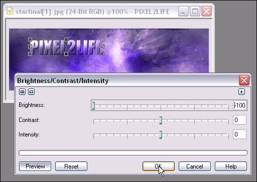
Step 10: Let’s darken up that text so it can be used for a dropshadow.  Click on Image > Adjust > Brightness/Contrast/Intensity or just hit ‘Ctrl-B’ to bring up the adjustment tool.  Move the Brightness bar all the way left to make the text back.

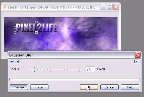
Step 11: One you have that done, we’ll apply a slight blur effect to the text to help blend it into a shadow that doesn’t have a harsh line.  Click on Effects > Blur > Gaussian Blur from the main menu to apply the blur.  You probably want to use a setting of 1 – 3 pixels, but as usual, feel free to play around!  Here’s what I used:

Step 12: We’ll now move the shadow into place.  For this tutorial, I simply moved the object a couple of pixels to the left and down.

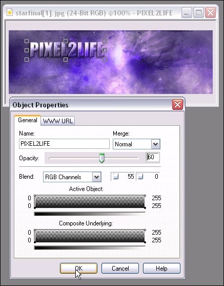
Step 13: The shadow is a bit dark, so we’ll add a transparency to soften it a bit.  Simply right-click on the shadow and click properties to bring up the properties window.  I used a value of 60%:

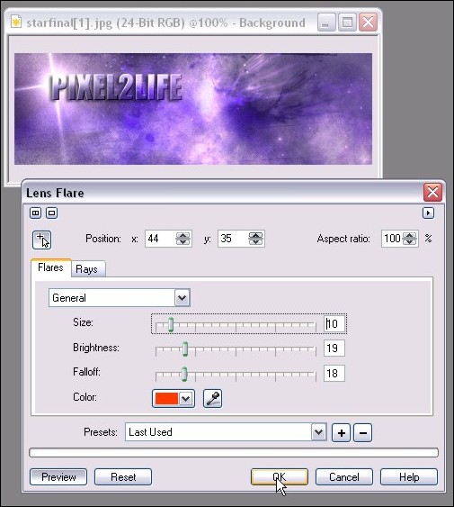
Step 14: We’re DONE!  That was pretty simply huh?  For additional dramatic effect, we can add some new elements to bring our the text such as a lens flare.  I added a Northstar 4-Point Flare for the heck of it:

Final Image:

Hope this helps you Corel folks 🙂  Please post any questions!
Dan

Realistic Frozen Ice Text Effect in Corel Photopaint v12

Realistic Frozen Ice Text Effect in Corel Photopaint v12

This tutorial was actually not intentional, but is merely some screenshots I took trying to figure out this effect. I had to make a logo for someone with “Icy” text and I hated the ones for Photopaint. They didn’t look like Ice at all… so I made my own. As I experimented with different effects I was mimicking from various Photoshop tutorials, I took screenshots as I went along so I could remember what I did. I finally found a combo of effects that resulted into some decent looking ice, so here’s a tutorial based on my “screenshot notes”.

Here’s the final result we’re aiming for:

user posted image
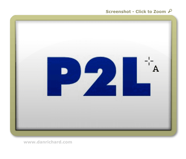
 Step 1: I’ve noticed that the bigger the text, the better this looks. I managed to pull it off on some pretty small text by playing with the filter settings, but for this tutorial, we’ll deal with some decent size text. First start out with a darkish blue font color and use a nice thick font like this:

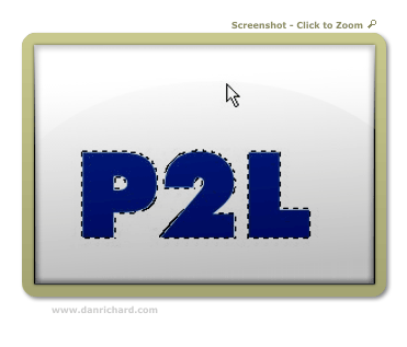
Step 2: Create a mask around the object by hitting ctrl-m

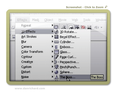
Step 3: We’ll start by running a built in 3D Effect called “The Boss”. Here is where it’s located and the settings I used:

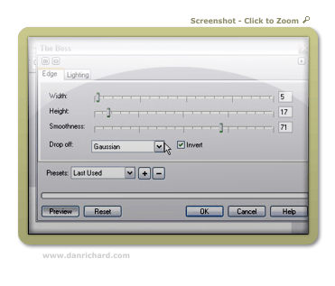
The Boss – Edge Settings:

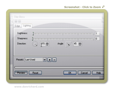
The Boss – Lighting Settings:

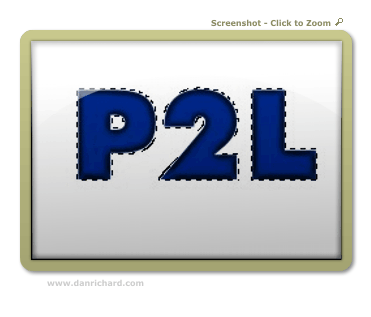
Here’s the final result of that effect:

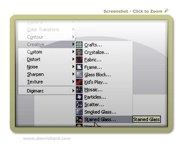
Step 4: Now we’ll need to apply a filter of some sort that will add texture to our ice. I’ve found that the stain glass filter works the best. You can find that here:

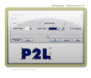
Use these settings and you can see what you get:

Step 5: After you have applied your stain glass settings, make a duplicate of the object we’re working on copy/pasting a new one. You should now have two objects in your object docker – both the same text with our effects. Click on the top object and proceed to step 5.

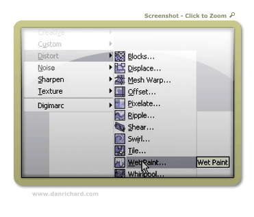
Step 6: We’re going to run the wetpaint filter on the top object so we can have some icicles on our text. You can find that effect here:

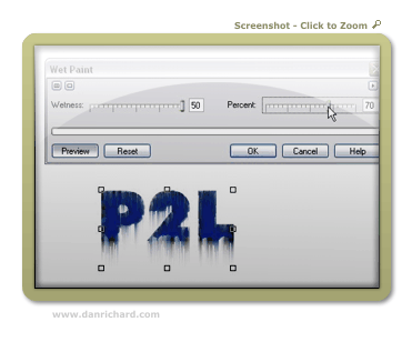
I used the following settings and got this:

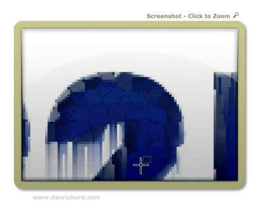
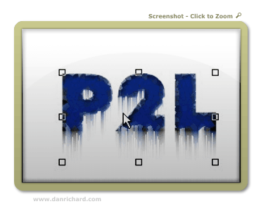
Step 7: Now we have a small issue… the top of the text has “icicles” running down the front. We don’t really want that in there – there should only be icicles hanging off the bottom. So grab your mask or eraser tool and cut away the unwanted parts of the wet paint effect. You can see in this example that I’ve removed the icicles off the top of the “2” but there are still some that need to be cut away on the inside left portion:

Once you have it all cleaned up, you’ll have something like this:

Go ahead and combine the two objects by selecting them both in the object docker (hold shift and click on each object) and hit ctrl-alt-downarrow

Step 8: Now things start to look like ice! We apply the Plastic texturing effect, which can be found at:

Here are my settings and the results:

Step 9: You’re done! Now we add a dropshadow and some text for the sake of showmanship and voila! Iced text by Faken.

user posted image

Comments welcome!

Dan

Please be sure to check out my complete tutorial list for more great articles!

Text Reflection – Advanced Text Reflections With A 3d Perspective and Effects in Photopaint!

Text Reflection – Advanced Text Reflections With A 3d Perspective and Effects in Photopaint!

Software: Corel Photopaint v11

It’s been a little while since my last Corel Photopaint tutorial simply because of the sheer volume of work I’ve experienced with the Pixel2life version 2 release AND the increase in submissions, but I’ve set aside a few minutes to put out something new for the minority crowd of Corel users. One of the tutorials I’ve seen the most lately for Photoshop is how to create a text reflection, so obviously this is a pretty popular effect that people are looking to do. I’ll admit right now, this is a boring effect that takes about 3 seconds to figure out, and quite frankly I think anyone who knows how to write text in Photopaint can figure out how to flip it over and make a reflection. No rocket science there. BUT what I don’t see is a few of the subtle tricks that help give the reflection that added 3D look and feel, along with a few other simple built in filter tricks to jazz things up a bit.

So today we’ll cover a basic text reflection effect along with added 3D perspective touch-ups and finally, some small filter tricks to liven things up a bit. Anyone and their monkey can create a simple reflection, so lets try to spice it up a bit shall we?

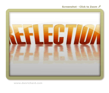
Here’s what we’re going to make:

user posted image

*Puts on his glasses and bowtie and strikes a grandiose pose, chalk in hand*

Shall we begin?

Part 1 – Creating Gradient Text Without a Gradient Fill!

First things first, we’ll create our basic reflection with some nice pseudo gradient text. You can skip the gradient stuff and just use a single color text, but at least this will give you some experience with some of the nifty tools in Corel Photopaint. I probably use the Interactive Object Transparency Tool every time I open Corel, so naturally you’ll see me use it in a tutorial.

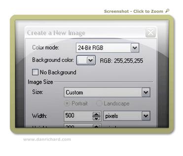
Step 1: Start up Corel Photopaint and create your new document. Here’s the settings I used for this tutorial:

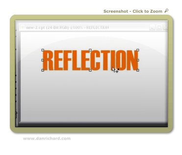
Step 2: Select your Text Tool from your toolbar (or hit T) and type out the text you want to use in whatever font you desire. I tend to use thick fonts for these effects so that my filter effects stand out better, but it’s totally up to you. Pick a nice bright color for your fill… I’ll use good ol’ orange!

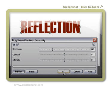
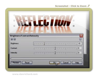
Step 3: Once your text is typed out, switch to the Object Picker Tool by hitting O and then create a duplicate of your text by hitting Ctrl-C (Copy) and then Ctrl-V (Paste). This will create a second set of the text. We’ll start creating our gradient text so click on Image > Adjust > Brightness/Contrast/Intensity and darken your text up a bit. Here’s the settings I used for a dark orange tone:

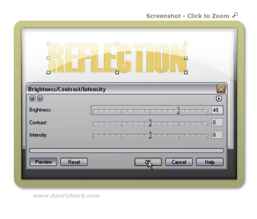
Step 4: Now create another set of that text by hitting Ctrl-V (paste), and then once again load up the Brightness/Contract/Intensity Tool and lighten that text up to a brighter orange tone. I’m uses these settings:

Step 5: Zoom in a bit and we’re ready to start our fake gradient effect! Now I know we can do this by creating a gradient style fill like in my orb tutorial, but this will help get you used to that wonderful Interactive Object Transparency Tool I mentioned.

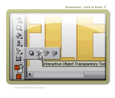
So now now go ahead and select the Interactive Object Transparency Tool from your toolbar!

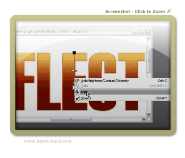
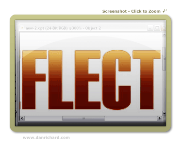
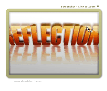
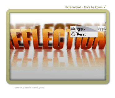
Step 6: Move your mouse cursor to the top of the text and click and hold down your left mouse button. That will lock where you want the solid part of the object to start. Next, drag your mouse downward and select where you want the object to end. When you’ve decided where the transparency should finish, release the left mouse button. If you’re happy with the preview, right click on your canvas area and click apply. If you don’t like it, hit Esc to start over.

Here’s the tool in action:

After I clicked Apply:

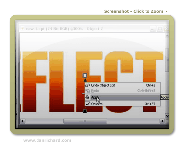
Step 7: Repeat step 6 for the darker text. First go to your object docker (If it’s not open, hit Ctrl-F7) and select the dark text object. At the moment you should still be on the light one. Once you’ve selected the dark text object by clicking on it in the object list docker, use your transparency tool again, but start from the bottom and go up instead of vice versa.

In action:

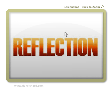
Final result:

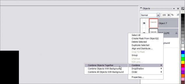
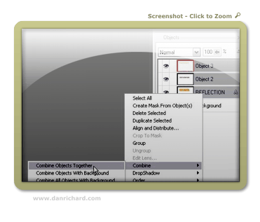
Step 8: Now we’ll need to combine all 3 text objects together and make them a single object layer. Just hold down Ctrl and click on each text object in the Object docker to highlite them and then right-click on one of them and click Combine > Combine Objects Together.

Once you’ve completed this step, you should now have your 3 color gradient text all in a single object.

Part 2: Playing with Perspective!

This step goes beyond your average reflection tutorial effect in the sense that we’ll play with the perspective to give this version some depth. The beauty of this effect is that you can play around with all kinds of versions. In this case, we’ll add a perspective to both the text and the reflection, but you don’t have to confirm to what I’m doing. You can apply the perspective to the text and NOT the reflection or do it the other way around and only apply a perspective effect to the reflection only. Or you can bypass the perspective twist altogether and leave everything straight up.

What exactly is perspective? Perspective is used in 2D images to give a sense of 3D depth. In the case of this tutorial, we’re going to bend text to appear that we’re looking at it from a top perspective. By changing different angles, we can completely change the overall perspective to suit just about any angle. Play around and see what you can come up with!

So let’s get crackin!

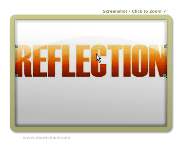
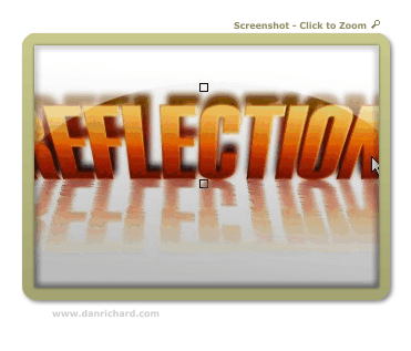
Step 9: Activate the Object Picker again by pressing O and then click on the text object 3 times. On your third click, you should see double arrows angled at 45 degrees on each corner of the object. If you don’t see those arrows, just click on the object until they come up. You should see arrows that look like this:

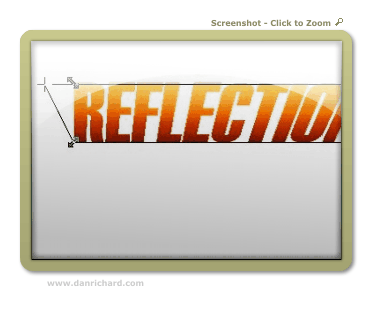
Step 10: Click and hold the arrow at the top right and drag it to the right to angle the top corner outward. Release the mouse button and your angle will be set. Now click the top left arrow and drag it to the left. Release when you have an angle you want to use.

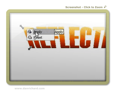
If you’re happy with your changes, right click on the object and click apply. If you want to start over, hit Esc.

Once you click apply, your new perspective angles are applied to the object:

Part 3: Create the Reflection!

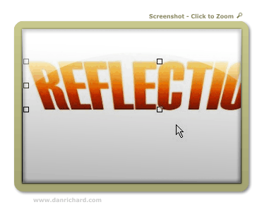
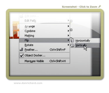
Step 11: Now we’re ready to create our reflection and play with some effects! So first hit Ctrl-C (Copy) then Ctrl-V (Paste) to create a copy of our text object. Once you have tha done, click on Object > Flip > Vertically.

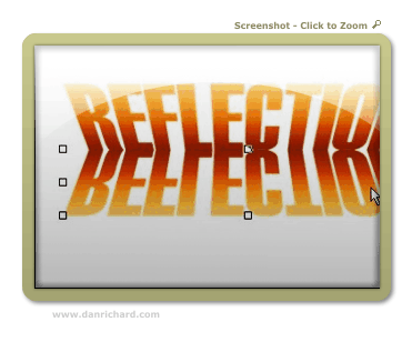
Step 12: Use your mouse to click on the “upside down” text and drag it so that the top of the “upside down” text lines up with “right side up” text. You can choose to have the two objects touching, or try it with a little gap between the two. With a space, it’ll look like the object isn’t quite touching the “reflective surface”. For this tut, I made it touching…

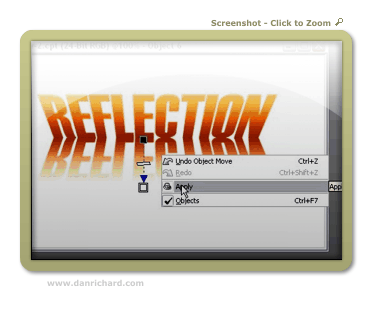
Step 13: For an added effect, we’ll have our reflection fading out as it gets further from the object. You can leave it completely intact if youw ant, but I like it better this way. So take out the good ol’ Interactive Transparency Tool again and starting from the top of the reflection, fade it out at the bottom.

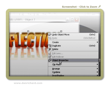
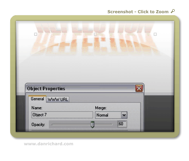
Step 14: You may feel that the reflection is still a bit too powerful, so we’ll tone it down a tad. Right-click on the reflection and click Object Properties. In the box that opens, lowe the opacity to tone down our reflection. I set mine to 60%:

And now our reflection is done! You can quit while you’re ahead or we can play around a bit with the built in filter effects and jazz up our reflection a bit more! If you’re feeling brave, here’s some tricks I used to acheive the final image! (Don’t you hate tutorials that show you a “final image I made” but don’t show you how exactly they did it?).

Part 4: Playing with Filters!

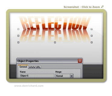
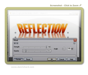
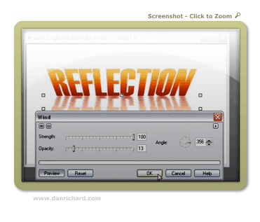
Step 15: If you’ve ever seen a reflection in water, it’s not always a perfect pane of glass type of reflection… it’s usually rippled with a bit of distortion. Well we can easily achieve this with the Wind effect! Make sure you’ve selected the reflection object with your Object Picker and then click on Effects > Distort > Wind. We’re going to distort both to the right AND left for this effect, so here my settings for the two times I ran the filter:

First pass goes towards the left (Note the angle dial):

Second pass goes right:

And you’re done your rippled reflection!

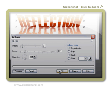
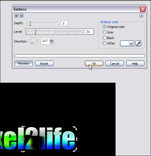
Step 16: Let’s increase the 3D look of our initial text shall we? Select the main text object with your Object Picker and then click on Effects > 3D Effects > Emboss. Play with the 2 sliders to see what it does to your image! Here are the settings I used:

Here’s how our reflection is looking so far:

Step 17: Shall we add some shadows to our artwork? Well it certainly won’t hurt to acheive additional depth to our image! We’ll need to create another copy of our text, so once again, hit Ctrl-C (copy) and then Ctrl-V (Paste).

Step 18: As we did in step 3, load up the Brightness/Contrast/Intensity adjustment tool and darken our new text object. Here’s the setting I went with:

Step 19: Now we need to move things around a bit in the object docker so that the dark text is in the background. Click and hold the dark text object in the Object Docker and move it down so that it’s under the first text object layer. This will move your dark text behind the brighter one like this:

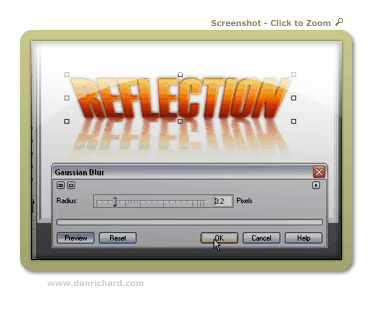
Step 19: Let’s add a little bit of a blur to our shadow. Click on Effects > Blur > Guassian Blur and apply a small bit of blur. You can play around with different settings, but I usually use a blur of 1 to 3:

Step 20: Use the up arrow on your keyboard to move the shadow up a few pixels, or just drag it up slightly with your mouse:

Step 21: More perspective? Well, it’s not necessary but I figured a bit of a perspective change on the shadow would add some “Je ne sais quoi” 😉 So once again click on the object until the perspective arrows show up and then drag the upper corners to the desired angles. Here’s how I did it:

Step 22: After I applied my new angles, the shadow was a bit too high, so I moved it down about 4 pixels… just being picky I suppose. Here’s where things are at:

Step 23: Once again we can tone down the shadow by right-clicking on the object and clicking on Object Properties:

I turned down the opcity to 60% for this tutorial:

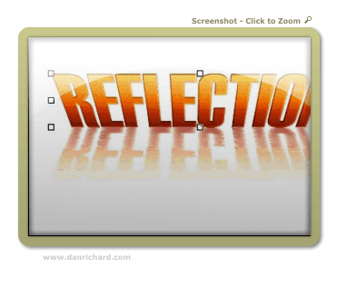
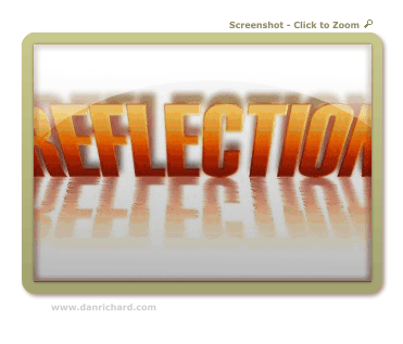
And now we have this:

Step 24: One last little tweak just for the heck of it! I want to increase the contrast between the top and bottom of the text that’s being reflected and keep my reflection the same. This theoretically would increase our 3D look even more!

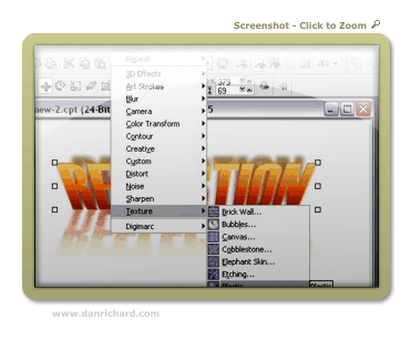
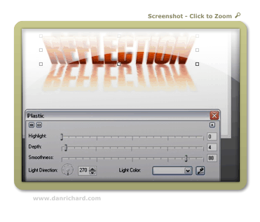
So click on Effects > Texture > Plastic

Playing around with the settings will give you LOADS of different looks… here’s what I went with:

And VOILA! Here is our final image!

user posted image

I hope you enjoyed the tutorial, and please feel free to post comments or questions!

Thanks,
Dan
Please be sure to check out my complete tutorial list for more great articles!

Advanced Multicolored Glass text in Photopaint!

Advanced Multicolored Glass text in Photopaint!

Jay is going to pass out when he notices I’ve written a fresh Corel tutorial for Twodded, but after a request from a very good friend of mine came through for how I make my multicolor glass text, I decided now would be a good time to freshen up my tutorial writing skills. *snicker* This particular style of text is quite similar to the other shiny effects I’ve used in a couple of tutorials, except I play with a lot of contrasting alterations to create the multiple hues and vibrant colors the text usually has. This isn’t actually very difficult, but it requires a lot of experimentation to find a combo that works with your image.

You see, the entire concept relies on using a single image to create all your multiple hues, so depending on the color/lighting attributes of your image, the settings I use may completely backfire for you. Now now… no need to worry! I’ll walk you through each painful step, and let you know when it’s time to break free of the mold and try different settings to get the right effect. After all, you’re not a lemming are you?

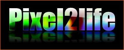
So, here is the effect we’re going to create:

Now don’t let the length of this tutorial fool you… I just like turning simple things into novels. Once you learn this technique and don’t need to read through each step, you should be able to do this in about 5 minutes.

FINAL NOTE: I am assuming you have some basic experience in Corel Photopaint and I do not have to explain some of the simple principals such as what the “Object Docker” is and such… if you’re not sure on some steps, please review some of my older tutorials that cover these basic tools and tricks.

Shall we dance?

Part 1 – Creating the Text Overlay!

First thing we need to do is create our pattern for the text overlay. Basically we’re going to make a blurry colorful object, then slice it into the desired text.

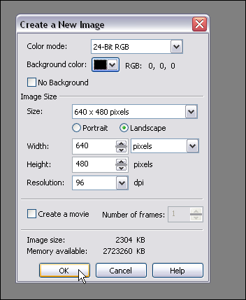
Step 1: Fire up Corel Photopaint and create your new document. For our text, I’ll be using the following settings:

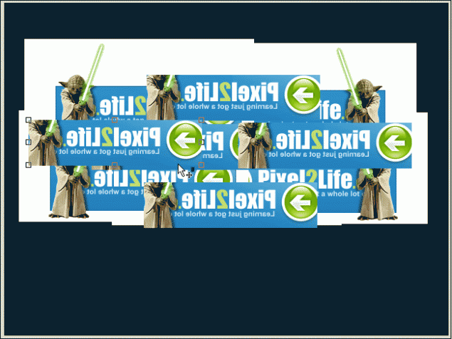
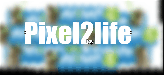
Step 2: Pick an image that you like and paste it all over the place… feel free to just use parts of the image, flip it around, invert it etc… just play around and drop stuff randomly. You can also use various images, so it’s really up to you at this point. I decided to just grab my sig from the P2L forums and dump that around a few times in various positions.
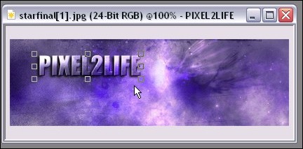
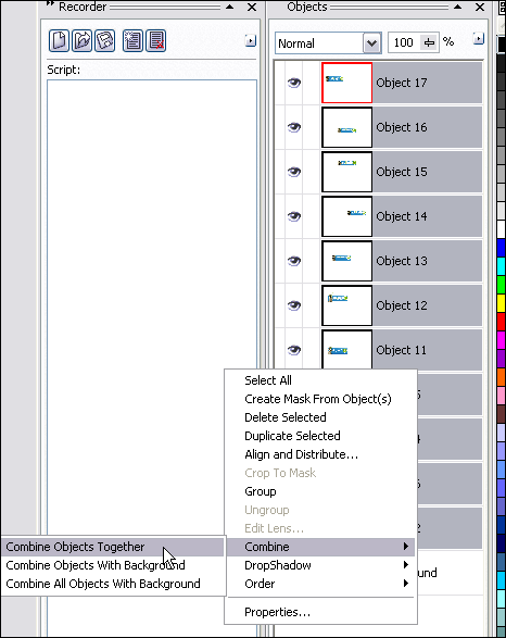
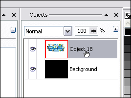
Step 3: Once you’ve got everything pasted the way you like it, select all the objects in your Object Docker and combine them to a single object layer.

You should now only have 2 object layers… the background and the object with your image(s) pasted in various positions.

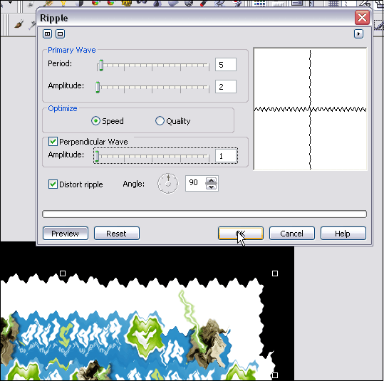
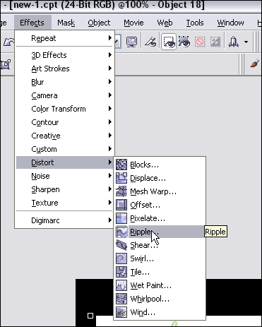
Step 4: Time to distort our text and mess around a bit. I encourage you to try using all kinds of distortion effects and not just follow what I do. You can get all kinds of great results just by trying a few random filters you’ve never played with before! I’ll start off by using the Ripple Effect.
I used the following Ripple settings:

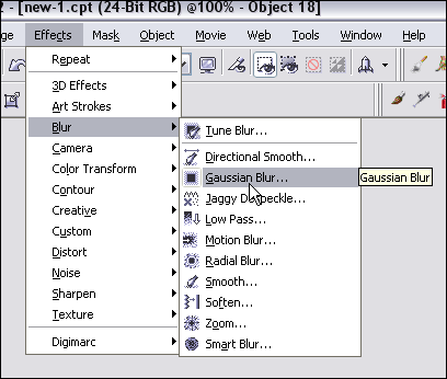
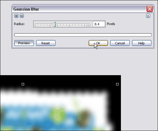
Step 5: Once you’ve distorted the images to your satisfaction (I’m easily pleased), you’ll need to blur it up to get the soft vibrant colors in the text. I’ll use a Gaussian Blur effect for this step.
My settings for Gaussian Blur:

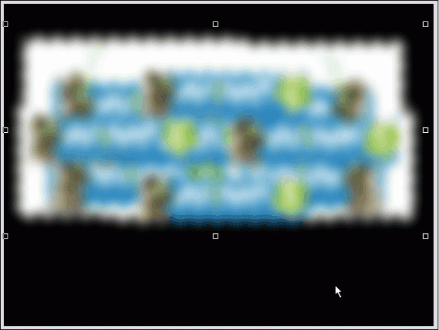
And the final result (Ignore the gif formatting with the poor blending in these screenshots… when you’re working in the program, it should stay nice and smooth for you. I reduced the quality to keep this tutorial down in size):

Step 6: Add your text! Select a nice font (Thick fonts are always more effective, but you can use whatever you like) and type out your message. The color you use doesn’t matter in the slightest, so use whatever tickles your fancy. I’m going to use Impact for this one.

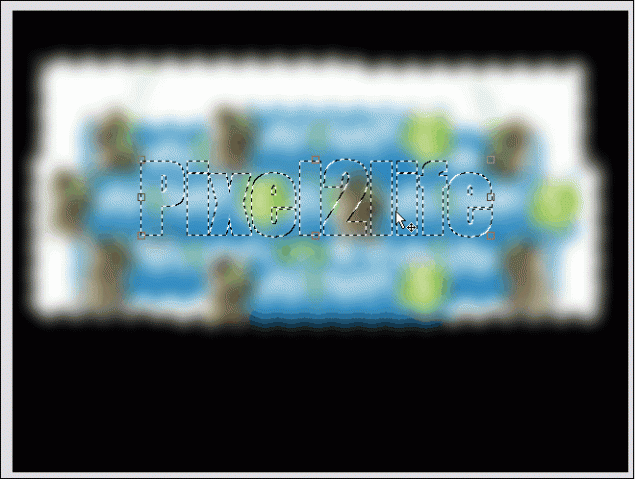
Step 7: Now create a mask around your text.

Step 8: Select the blurred image on the object docker… we’re going to cut a piece out of it with the mask we’ve created!

Step 9: Make sure you have the mask tool selected… doesn’t matter which one, but make sure you have it selected instead of the Object Picker. If you don’t, the next steps will have you reaching for the bottle of Tylenol.

Now hit Ctrl-C then Ctrl-V to Copy/Paste the masked area and POOF! You’ve created some overlay text!

Part 2 – Working the Text!

Step 1: Let’s clean up the object docker a bit… we’ve got some goodies we don’t need in there. Start by removing the mask.


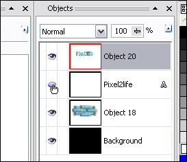
 Then hide the original text object in the Object Docker by clicking on the hide object icon.

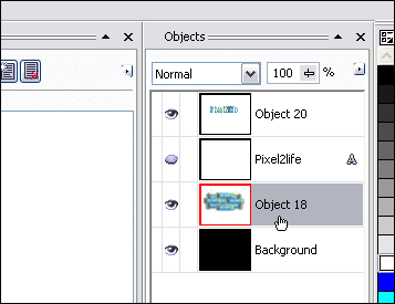
And finally, select the blurred image object and hit delete to remove it.

Now you should have a nice tidy Object Docker! Don’t worry… it’ll get real messy in a sec! Just click on the text overlay object and we’re ready for the next step.

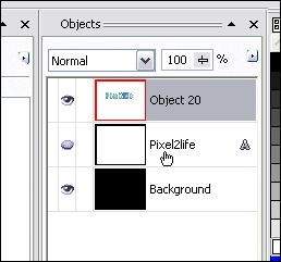
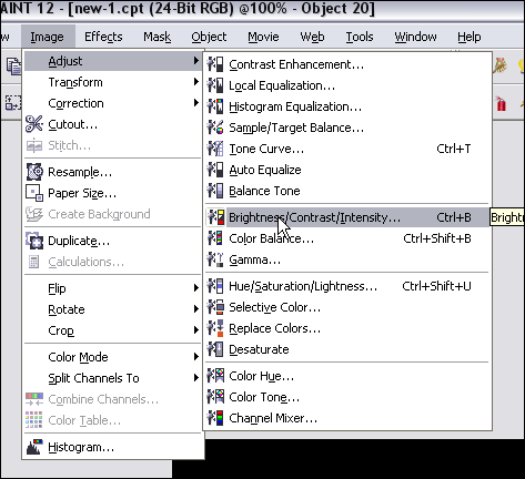
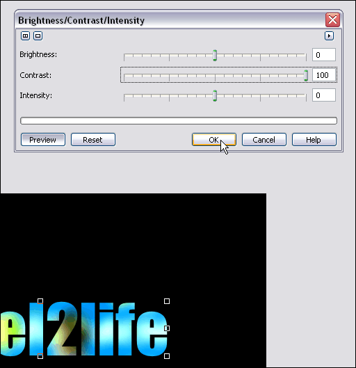
Step 2: We’re going to start off by cranking up the contrast on our overlay text to enhance the color and just brighten the text right up. Now, THIS is where you need to experiment. I suggest cranking up the contrast all the way up, but play around with the Brightness slider until you see something you like. If your image is very dark, I suggest you turn up the brightness quite a bit, apply it, then re-run the tool and increase the contrast. Like I said, you have to play around with this.

So, here’s what I did with my text:


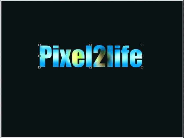
This is what I have so far:

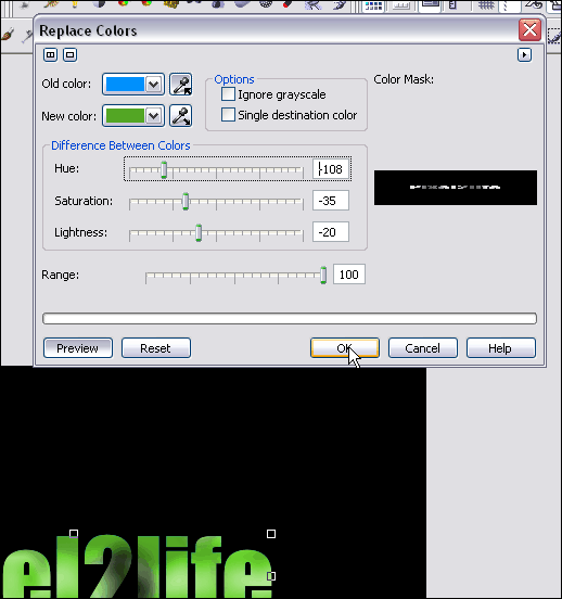
Step 3: Once you have the text the way you like it, hit copy/paste again and make a second copy of your text. Feel free to play with the Brightness and Contrast again, or in my case, I’m going to replace the colors with a green cast. You can also just adjust the hue… works quite well.

Here are the settings I used for the color replace:

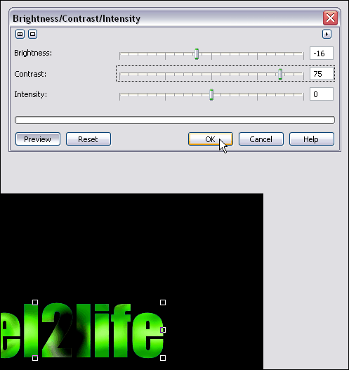
Step 3: I then take my green text and crank up the contrast yet again:

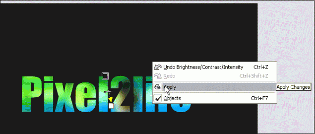
Step 4: Now it’s time to blend our two text objects together and make everything purdy! For those of you that follow my tutorials, you know what time it is! Time to break out the Interactive Object Transparency Tool!

I faded my green text downwards and slightly to the right. Once you have your fade gradient the way you like, apply the settings.

NOTE! If you don’t know how to use the Interactive Object Transparency Tool, I recommend you check out step 7 of THIS tutorial for detailed instructions on how to go about it.

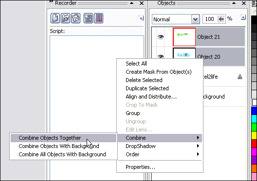
Once you’ve set your transparency gradient, use the object docker to combine the two text objects together.

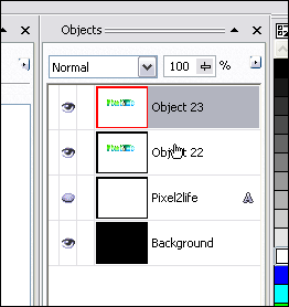
Step 5: Getting close! It’s time to create the “shine” part of our text! Select the text object in the docker and do another copy/paste to create a second object.

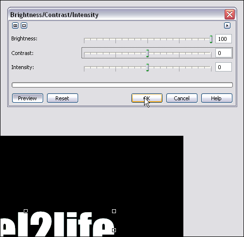
Step 6: Pump the brightness all the way up on this object to make it all white. Make sure the other sliders are set to 0.

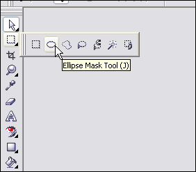
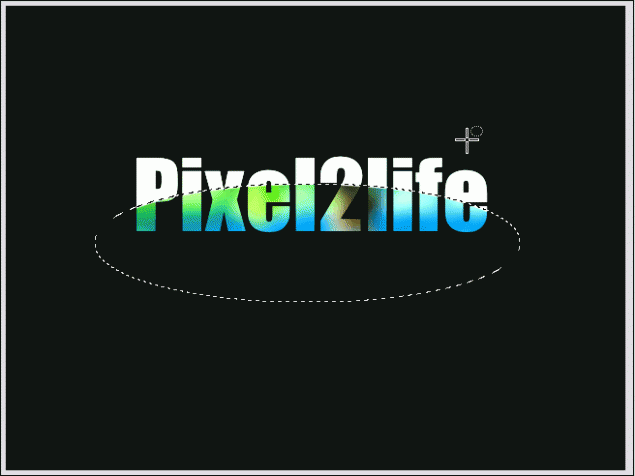
Step 7: Using the Ellipse Mask Tool, we’re going to cut out a chunk of the white text for our shine effect. Start by selecting the tool:

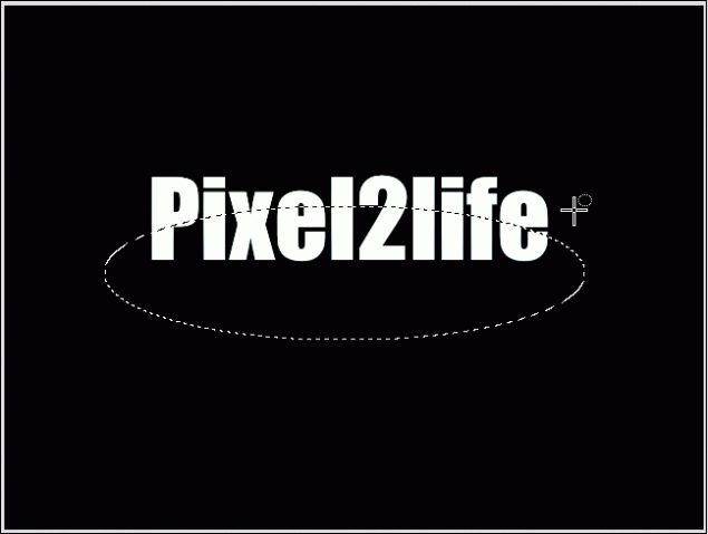
Mask off an area like this:

Hit delete to cut out that part of the mask:

Step 8: Once again, use the Interactive Object Transparency Tool to fade the “shine” part downwards like this:

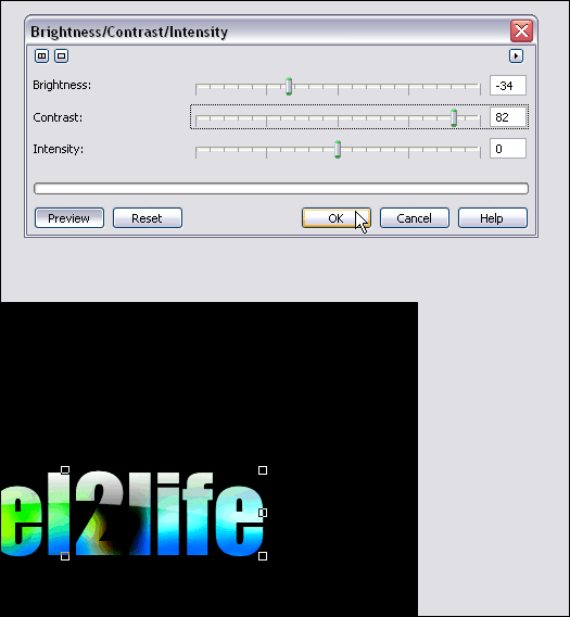
Step 9: Time to play with contrasts and objects again! This is just to tweak the text a bit and get it to a level I like. I’ll start off my clicking on the text object and re-adjusting it’s contrast.

Step 10: Create a second copy of this text by hitting copy/paste again.

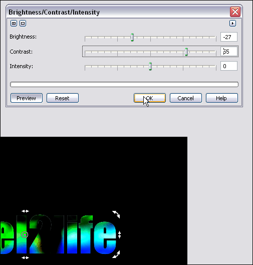
 Step 11: Tweak this object’s contrast… I want to use this to darken up the bottom of the text a bit.

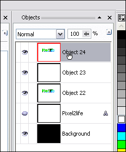
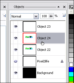
 Step 12: Move this object down one level so the shine is once again visible.

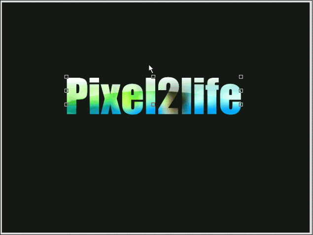
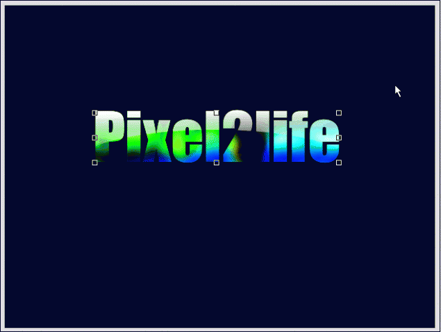
 Step 13: Now this time around, use the Interactive Object Transparency Tool to fade the top layer upwards. This will give your text a brighter upper area and a darker bottom.

Part 3 – Finishing Touches!

Step 1: Combine all your text objects together and delete any hidden objects you have still in the Object Docker. You should only have 3 objects at this point… the background, the text object and the shine object. Click on the text object and we’ll apply a slight emboss effect to it.

Here’s the settings I used for the emboss:

And we’re done! I added another layer of colored text and added a shine effect (Check out this tutorial to learn how to create a text shine effect) Here’s my final result:

I hope you enjoyed this tutorial and as always, keep experimenting when you draw and have fun! Until next time, have a safe and happy holiday and I’ll see you in 2006!

Dan