Blended Text Tutorial – Create Text that Blends into your Sig’s Background in Photopaint
We’ve all seen the tutorials all over the place on how to blend text into the grunge or 3d render background of sigs in Photoshop. This style is extremely popular these days and looks great for pretty much any kind of background. In fact, to emphasize this point, I’ve randomly selected a background from one of the tutorials in the P2L index to show you how this can be done with any image in Corel photopaint!
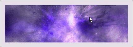
For this tutorial, I’m going to use the background effect in this Photoshop signature tutorial titled Star Explosion – Create this interesting Exploding Star / Nebula effect. Here’s what it looks like.
Here’s how to add your blended text:
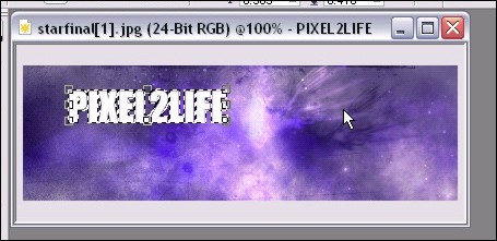
Step 1: With your image open in PhotoPaint, select the Text tool (Type ‘T’) and add some text with decent width and size. Don’t make your text too tacky by going HUGE, but keep it a good size so the effect comes out properly. If your text is too thin, the effect is lost somewhat.
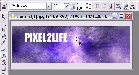
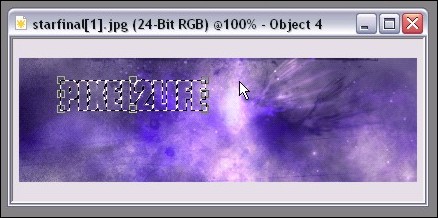
Step 2: Once you’ve completed your text, create a mask from the text (Mask from Object) by hitting ‘Ctrl-M’ and this will form a mask around your text.
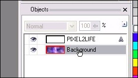
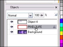
Step 3: In your object docker, select the background by clicking on it once or simply click on the background itself with the Object pick Tool (hit ‘O’). This will ensure that the next steps will apply to the background rather than the text object.
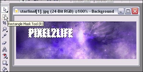
Step 4: Select the Rectangle Mask Tool by hitting ‘R’ – this will then tell PhotoPaint that any further steps will be applied to whatever is within the mask on the current object rather than the entire object currently selected, which is the background at the moment.
Step 5: Now you need to run a quick copy paste… you can either hit the copy icon, then the past icon, or use the hotkeys, which are ‘Ctrl-C’ then ‘Ctrl-V’. This will make a copy of your text, but using the background, and it will become your top object.
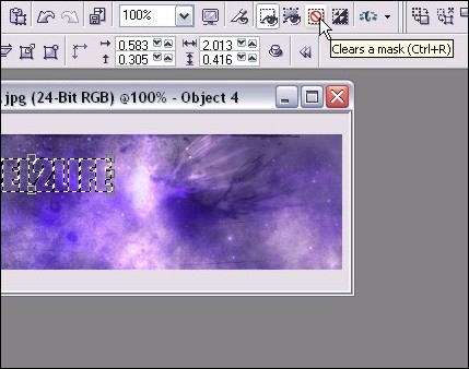
Step 6: Clear the mask by hitting ‘Ctrl-R’ or clicking the Clear Mask Icon. One the mask is cleared, any additional steps will apply to the entire object rather than just what’s within the mask.
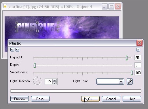
Step 7: Time to start playing with effects to bring out the text from the background. We want it to be blended, not completely invisible! To start, we’ll apply a plastic texture effect to our new object by clicking Effects > Texture > Plastic from the main menu. Here are the settings I used for this tutorial, but feel free to play around. You can really achieve a variety of blending strength by playing with the depth and highlight settings.
I have previews turned on so you can see what the effect looks like before actually applying it.
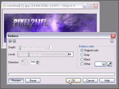
Step 8: We’ll want to add a slight Emboss to give the text a nice subtle 3D enhancement with shading. You can do this by clicking on Effects > 3D Effects > Emboss from the main menu. Here are the settings I used, but again, play around until you find something you like:
Step 9: At this point, let’s not forget we have the original text that we typed out in Step 1! We’re going to use that text to add a subtle dropshadow to our text. This will help bring out the text just a tad more to ensure it’s at least readable. This is especially effective if the text is a bit slimmer.
So once again go to your object docker (If you don’t have your object docker open, you can do so by clicking on Windows > Dockers > Objects on the main menu. You still won’t see it because the blended text is over it, but now we can apply some effects to it.
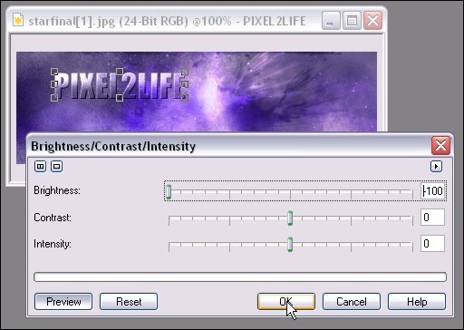
Step 10: Let’s darken up that text so it can be used for a dropshadow. Click on Image > Adjust > Brightness/Contrast/Intensity or just hit ‘Ctrl-B’ to bring up the adjustment tool. Move the Brightness bar all the way left to make the text back.
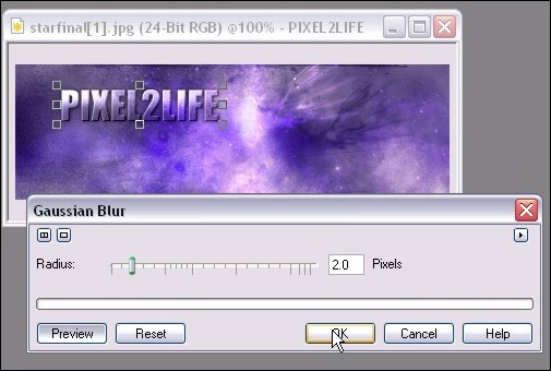
Step 11: One you have that done, we’ll apply a slight blur effect to the text to help blend it into a shadow that doesn’t have a harsh line. Click on Effects > Blur > Gaussian Blur from the main menu to apply the blur. You probably want to use a setting of 1 – 3 pixels, but as usual, feel free to play around! Here’s what I used:
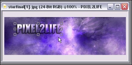
Step 12: We’ll now move the shadow into place. For this tutorial, I simply moved the object a couple of pixels to the left and down.
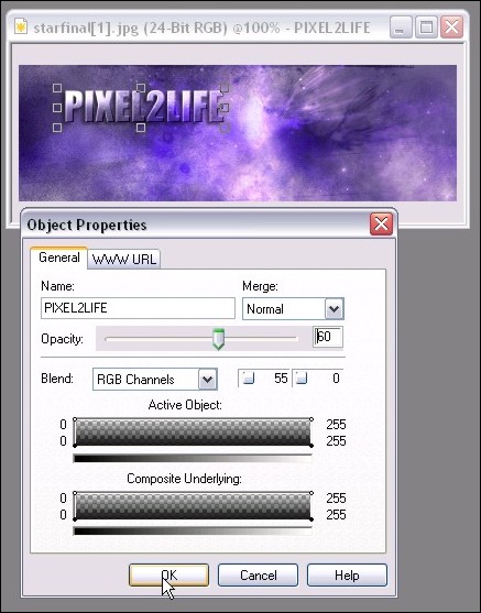
Step 13: The shadow is a bit dark, so we’ll add a transparency to soften it a bit. Simply right-click on the shadow and click properties to bring up the properties window. I used a value of 60%:
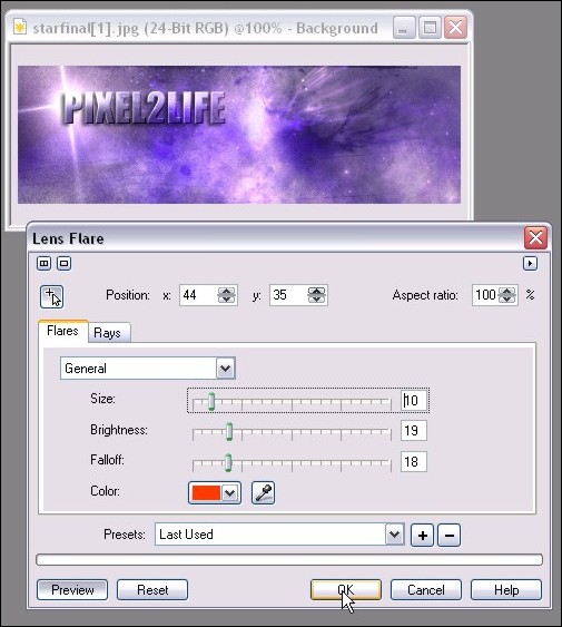
Step 14: We’re DONE! That was pretty simply huh? For additional dramatic effect, we can add some new elements to bring our the text such as a lens flare. I added a Northstar 4-Point Flare for the heck of it:
Final Image:
Hope this helps you Corel folks 🙂 Please post any questions!
Dan
