Slicing and Coding a Content Box in Photopaint and Dreamweaver
This is one of my first tutorials I ever wrote a couple of years ago, and it’s quite popular because so many new designers fine using tables to be confusing for layouts. Now I know the latest craze is pure CSS layouts, but I’m old school and still use tables. So, this is a concept that is a bit confusing for the new DreamWeaver users. I will show you how to slice up a basic content box and use DreamWeaver to create the tables and format the box to accept content without displaying a mess whenever the content is too much or the size of the browser window is changed etc…
First off, I will use Corel Photopaint to slice up the content box, but you can certainly do this in any graphics program, including Photoshop or even MS Paint.
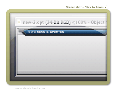
Here is the content box I made:
As you can see, this is a very basic content box with a header, footer and content area. For a HUGE and very complete guide to slicing, check out my massive slicing tutorial guide at www.slicingguide.com, which shows you step by step how to slice up an advanced layout. This tutorial is so big, it’s basically it’s own website!
If you’re new to slicing and using Dreamweaver, then start off with this simple concept tutorial, then move on to more complicated adventures is slicing land.
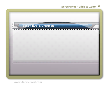
We will need to cut the box up into 3 sections… a top piece, middle section and bottom piece. I’ll start by masking the top section, copy it to clipboard (copy or ctrl-c) and create a new document from the clipboard.
We’ll name this header top.gif (click to view)
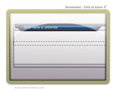
Next we do the same thing to create the middle graphic.
Name that middle.gif (click to view)
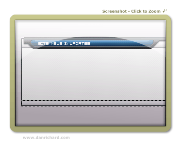
Last we do the same for the footer graphic…
Name that bottom.gif (click to view)
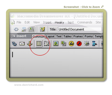
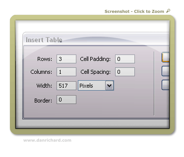
So now we have our 3 sections of the content box, time to load up DreamWeaver. Create a new document and start by creating a new table with the following settings:
For the width, you should put the width of the actual total image length. So for this content box, I know that it’s 517 pixels wide, so that will be the table size.
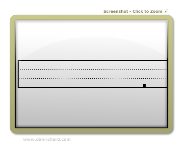
You should end up with a new table that looks like this:
We now have 3 rows to fill up. Click on the top row (Just click once anywhere in the row itself and you’ll see your cursor blinking in the row). Let’s insert your top.gif by clicking on Insert > Image and browse to the image you want and double click it. Top.gif should now be in the top row of your table.
Now click on the bottom row and do the same thing for bottom.gif
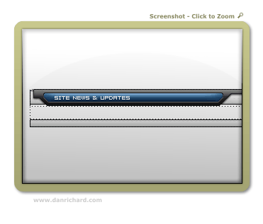
You now have this:
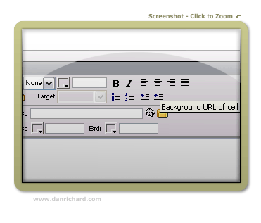
Now we insert the middle portion so that it fills up the middle portion properly as your tables changes height depending on content. Click on the middle row like you did the others. On the properties bar, click on the folder icon marked as “background URL of Cell”: (If you don’t have a properties bar, click on Window > Properties on the main menu to open it.)
Browse to your middle.gif and double-click to select it and voila! You now have the center row with the middle.gif set as the background image so you can write whatever you like, insert images etc…
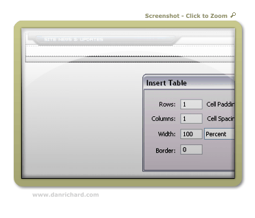
Now to add some content. You can go ahead and type stuff or add images to the middle row as is, but the text will be jammed right against the edge and won’t look to hot. So we can create a table inside that row with a bit of padding to keep the content off the edges of the box. Once again, click the middle row so that your cursor is in it and click the new table button. Use the following settings:
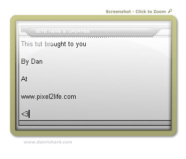
Hit ok and you can start adding your content to that new padded table. Your box should now look like this:
Hope that helps clear up some of the DW slicing mystery 🙂
Dan
Please be sure to check out my complete tutorial list for more great articles!
