Welcome to another Corel Photopaint tutorial! Today’s lesson is actually a tutorial request from a P2L community member, and despite there already being a couple of tutorial listed on P2L on how to do this, they felt mine was more realistic and wanted my recipe. As always, you should be able to follow this pretty closely in Photoshop as both applications share very similar tools and concepts.
On a side note, I am currently sick as a dog while I write this, so please bear that in mind when you shake your head at any grammatical errors among my usual rantings. I’m heavily dosed with NyQuil and Reactine (That’s about as hard as drugs get when you’re married), so things are a tad hazy at the moment. But fear not! Not even a cold medication induced stupor shall stop the typing!
Without further chatter, let’s proceed with masking tape goodness! Here is the final result we’re aiming for:

For those of you that read my blog or news articles, you’ve probably seen me use this effect quite a bit. What can I say? It’s a classic! If you’re ready to re-create this effect yourself, read on…
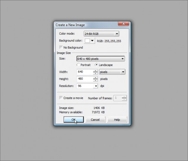
Step 1 – Let’s start off with a new canvas… Let’s go with 640 x 480 on a white background:

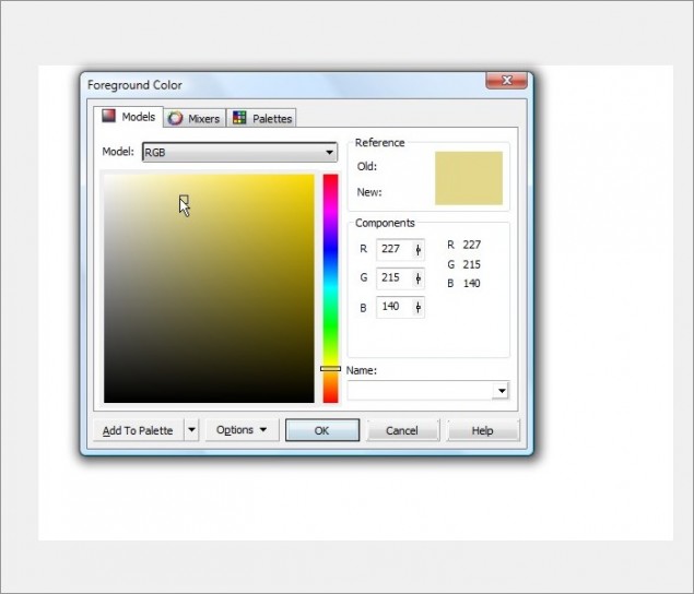
Step 2 – Next up, we’ll need to pick a color for your masking tape… masking tape tends to be a sandy color, something like sandstone, so I’ll go with RGB color code 227 215 140. Make this your background and foreground color:

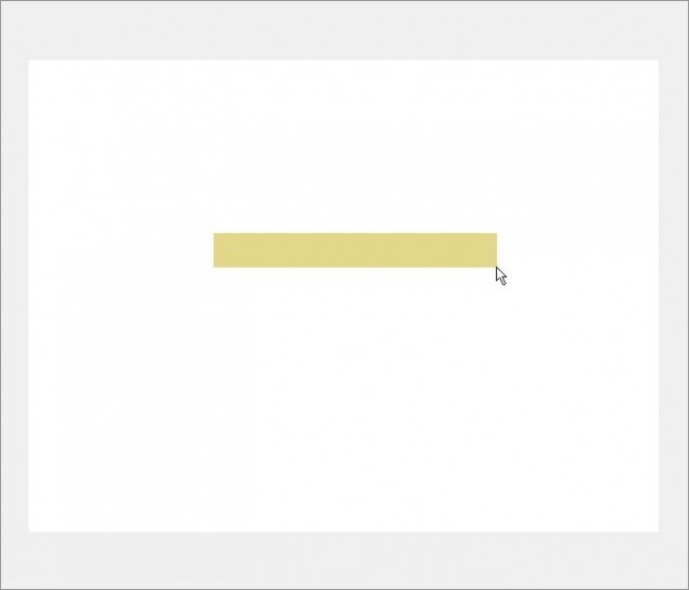
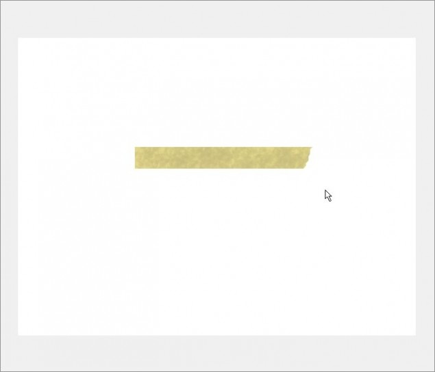
Step 3 – Once you have your colors all picked out, draw the general shape of your tape with the rectangle tool:

Step 4 – This next step is very important… If you happen to have some masking tape around, peel off a piece and gentle stick it to something, but don’t press it down. Notice that the color of the tape is pretty uniform? Ok, now press the tape down firmly against the surface and you’ll now see that the tape has slightly dark splotches where it’s making better contact than other areas of the tape. Well, that’s what we’re going to create here.
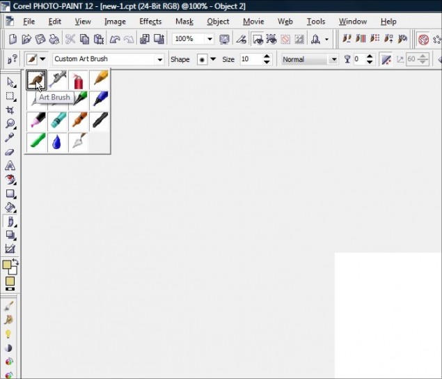
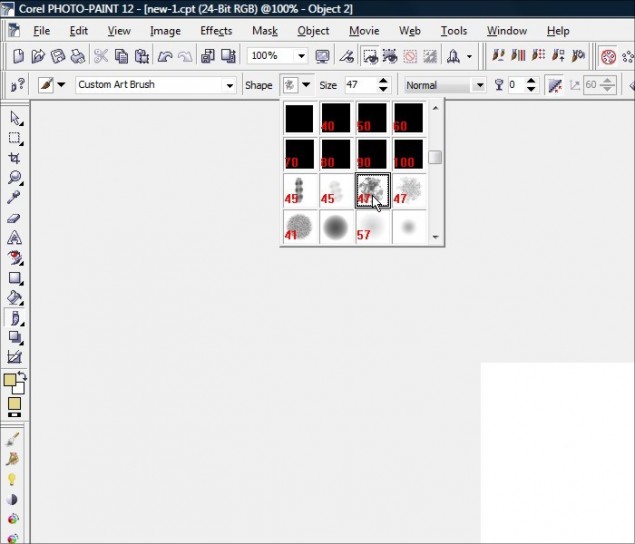
Start off by selecting the Paint Tool and be sure you are using a Standard Art Brush:

Then select the following Nib, which is pre-built in to Photopaint:

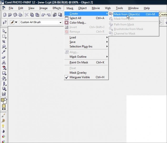
Step 5 – We only want our pen tool to apply strokes to the surface of the tape, so we need to apply a mask to the tape object we created. Simply click on Mask > Create > Mask from Object (or hit Ctrl-M) and you now have a mask around the object:

Step 6 – Now take a slightly darker foreground color than the standard sandstone you were using to create the initial object (double-click the foreground color and click edit to select a darker shade of your current color) and start brushing on the darker color:
WARNING: DO NOT click and hold the mouse button and drag the mouse around. Put your mouse in the spot you want to apply the color and do a normal click. Then move your mouse to a different position and click again.

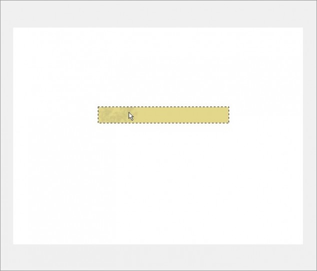
And here is the tape completely brushed:

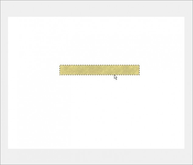
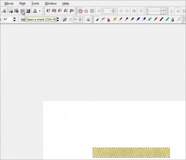
If you’re happy with the brushed effect and you’re ready for the next step, remove the mask:

Step 7 – Next we create the torn edges of the tape. A lot of tape tutorials will show you a technique where the end result is this weird shredded effect that, in reality, looks nothing like tape. If you take a piece of tape and tear it, it’s usually a pretty straight line or maybe a bit irregular, but it certainly doesn’t look like the end of a shag carpet!
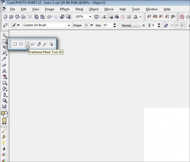
So, let’s start off by select the Freehand Mask Tool:

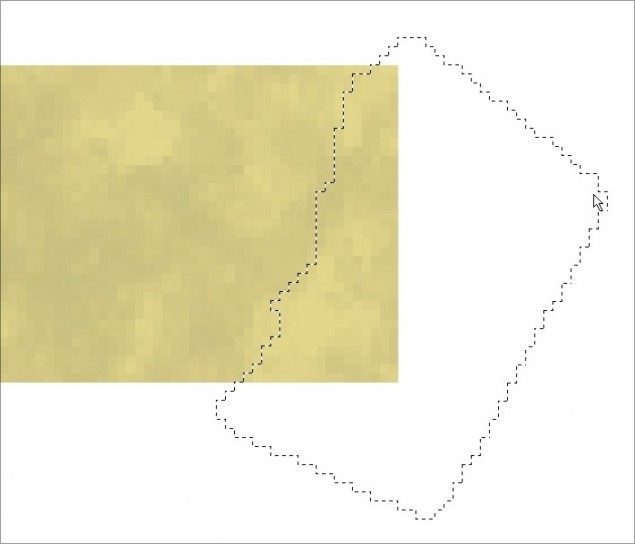
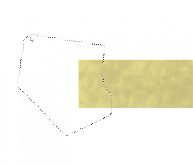
Step 8 – Now click the mouse where you want to start your mask (I started at the top) and drag it to a point farther down and click again. You’ll see your mask has started to form… down go down a bit more and click again until you are completely past the bottom of the tape. Now click around the outside of the tape to complete the mask and double-click on the last connection point:

QUICK TIP: In the sample above, I started at the very top and slowly clicked my way towards the bottom left. Once I was past the bottom of the tape, I then masked off the right side and double-clicked on the spot where I had first started the mask.
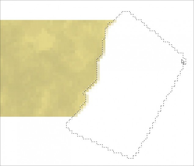
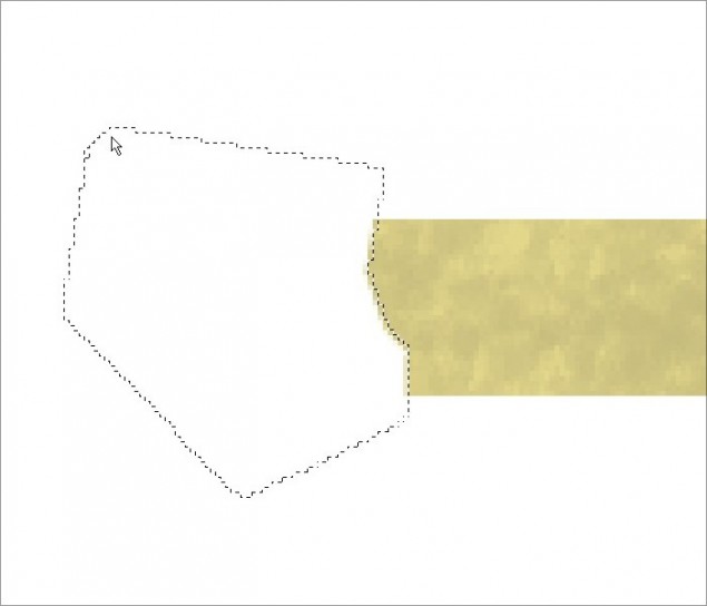
Once your mask is complete, hit the delete key on your keyboard and you now have a torn edge!

Here’s how it looks zoomed out:

Now do the same thing on the other side:


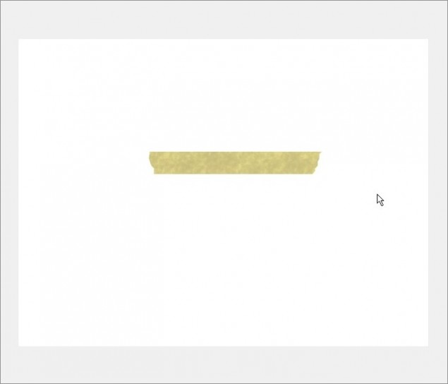
And now both sides have been torn off!

Step 9 – Let’s detail out our torn edges a bit… if you happen to have that piece of real masking tape I had you use to test out the “pressing down” effect, look at it again and you will notice that the torn edges are a big lighter that the rest of the tape. This is because the tape is slightly thinner where you tear it, as it tears diagonally, not straight through. Look at the illustration below, maybe that will help explain things…

So if you’re looking at the tape from the side with a REALLY good magnifying glass, you’d see that the tape doesn’t tear straight down, it’s actually diagonal, sort of like a knife’s edge. That causes the edge of the tape to be slightly thinner, making it more transparent. More light gets through, so it looks slightly brighter.
See? I told you I ramble!
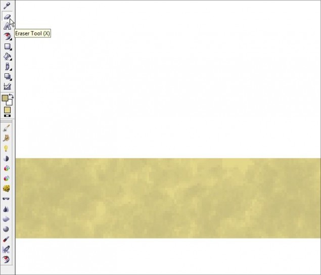
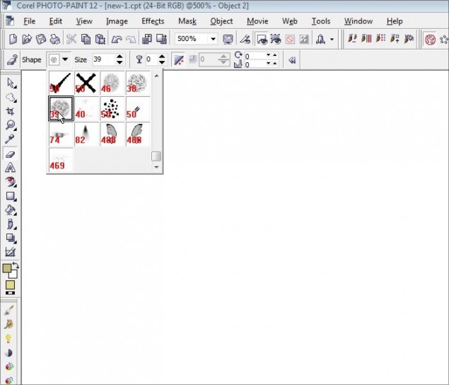
So with that out of the way, let’s lighten up the edges by grabbing the Eraser Tool:

Select a grainy Nib, like the one I am using below:

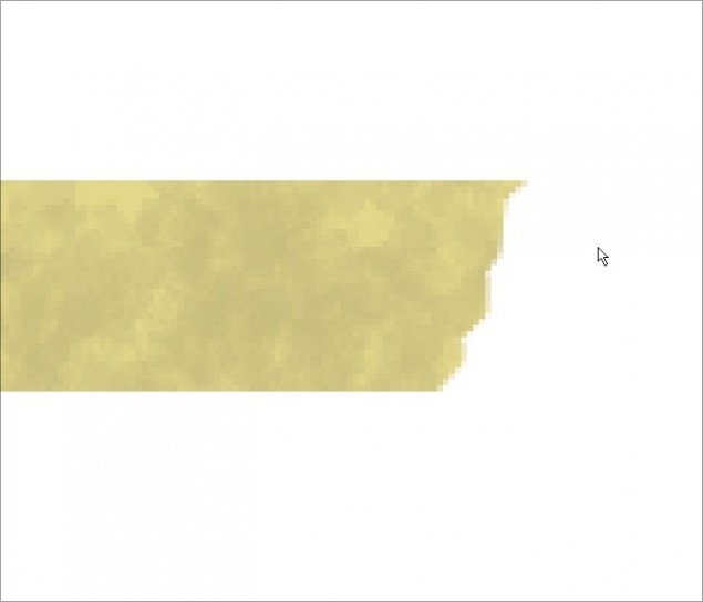
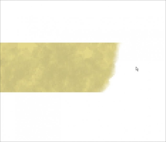
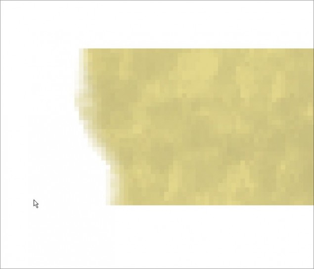
Step 10 – Now carefully erase the edge of the tape by clicking once, moving down a bit and click again. In this screenshot you can see the outline of the nib (No idea why it won’t capture) but you should be able to see it fine as you work. You only want the very edge of the nib to touch the tape as you erase the edge.

And here you can see the entire edge has been done:

Now do the other side:

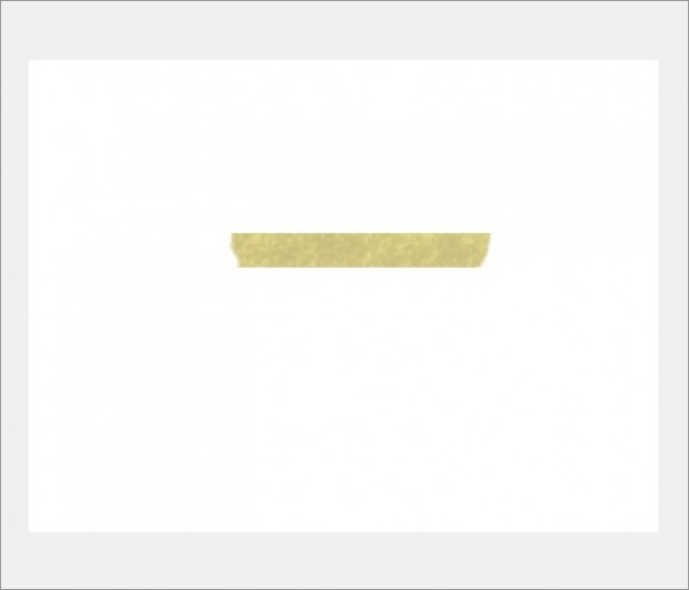
Our torn edges are done!

Step 10 – With our edges done, it’s time for a fairly minor step, but one I feel helps dial up the look of the tape a bit, especially if you’re using this tape on a light background. We’re basically going to give it a tony bit of a drop shadow, just to subtly outline the tape. Start by creating a duplicate of the tape object by doing a copy/paste:

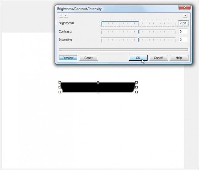
Step 11 – Open up the Brightness/Contrast/Intensity tool and turn the brightness dial all the way down so our new object copy is black:

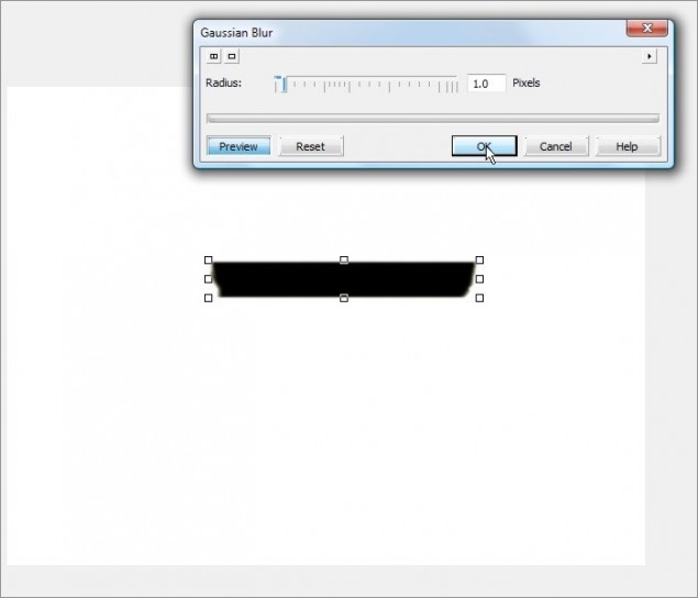
Step 12 – We’ll soften it a bit by adding a 1 pixel radius sized Gaussian Blur:

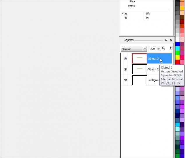
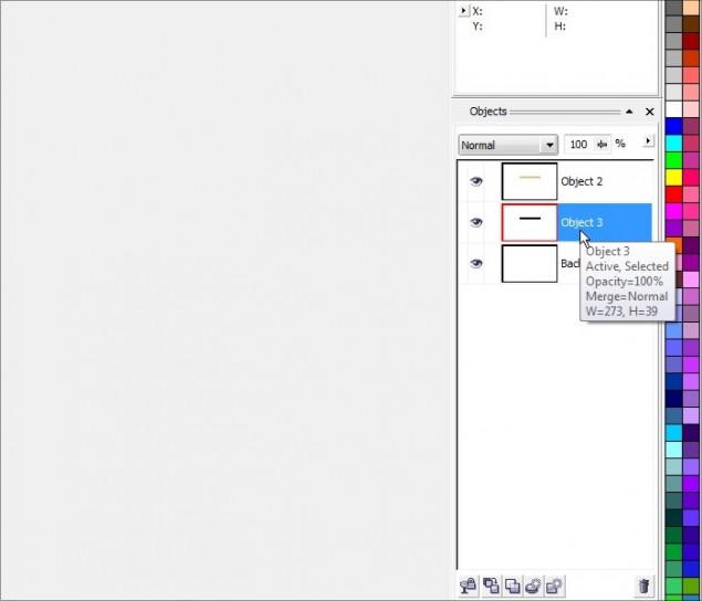
Step 13 – Move the new object that we’ve just darkened and blurred down behind the primary tape object layer in the docker:

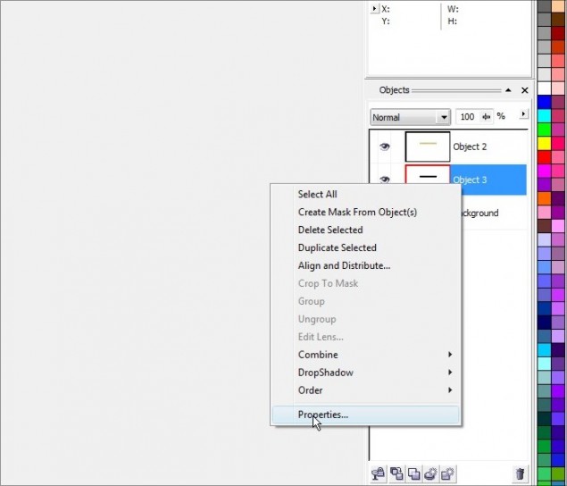
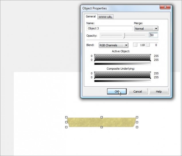
Step 14 – The black background is way too strong, so lets dial that down a bit by opening the properties of that object and lowering the opacity to around 50%.


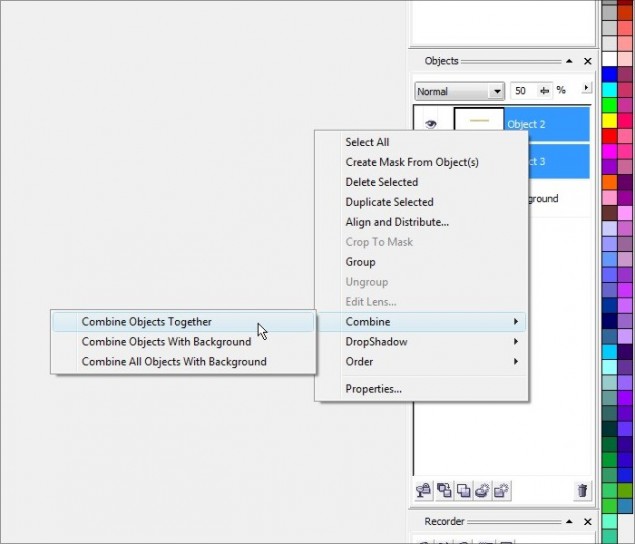
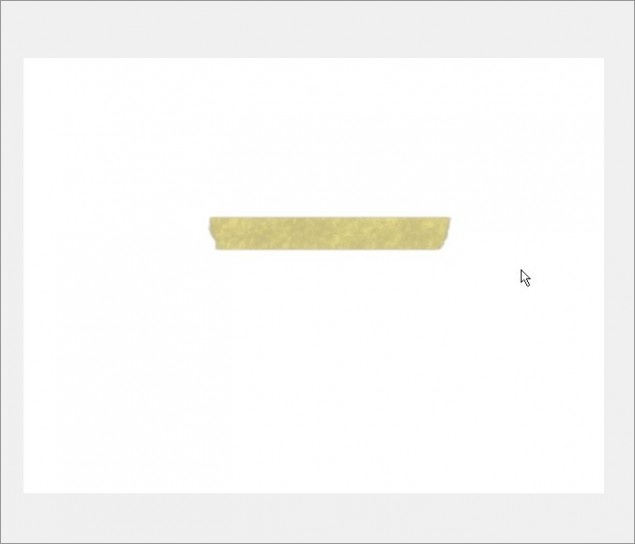
Step 15 – Now combine the two object layers together and our tape is done!


Now with that out of the way, I’ll show you how I use this piece of digital tape to “stick” photos and images to a webpage!
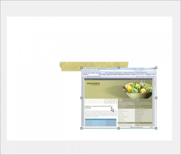
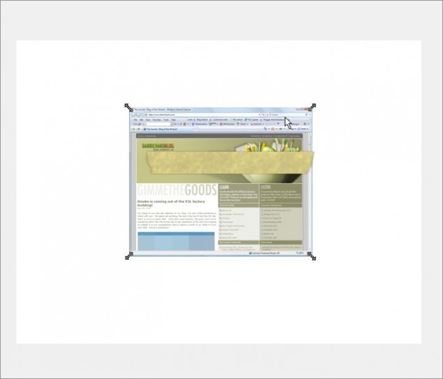
Step 16 – Paste in the image you want to stick… at this point, make sure the background color of your image is the same as the background color of the layout you’ll be putting this image in. In this example, I’ll assume the background is white:

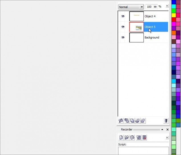
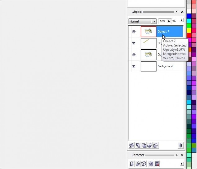
Step 17 – The tape is going to be on top of the image, not under it, so move the new image object below the tape object in the Object Docker:

Here’s where we’re at so far:

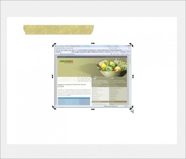
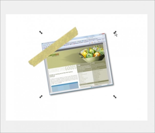
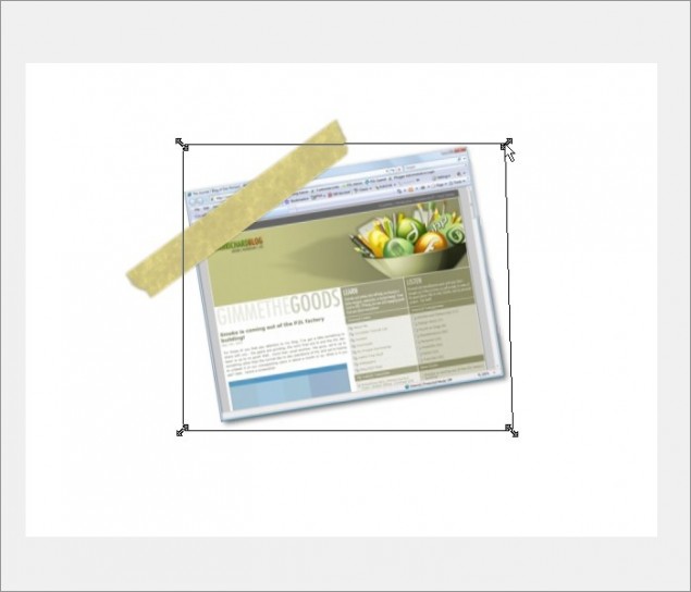
Step 18 – Now click on the image until you get the rotation arrows showing on each corner of the image like this (you’ll also notice in the next screenshot that I moved the tape out of the way a bit):

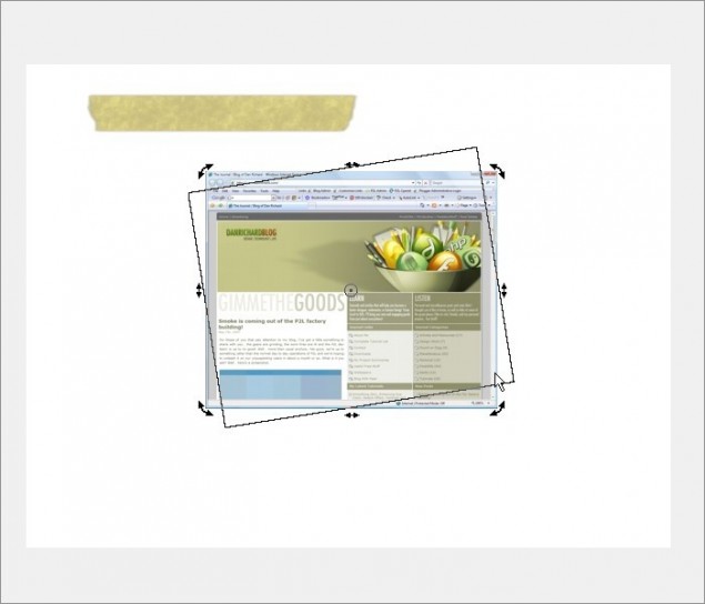
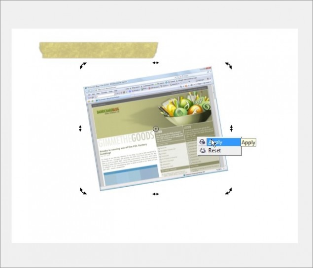
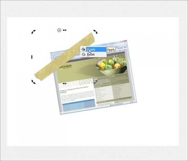
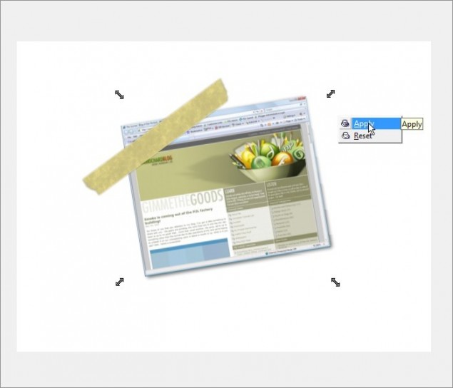
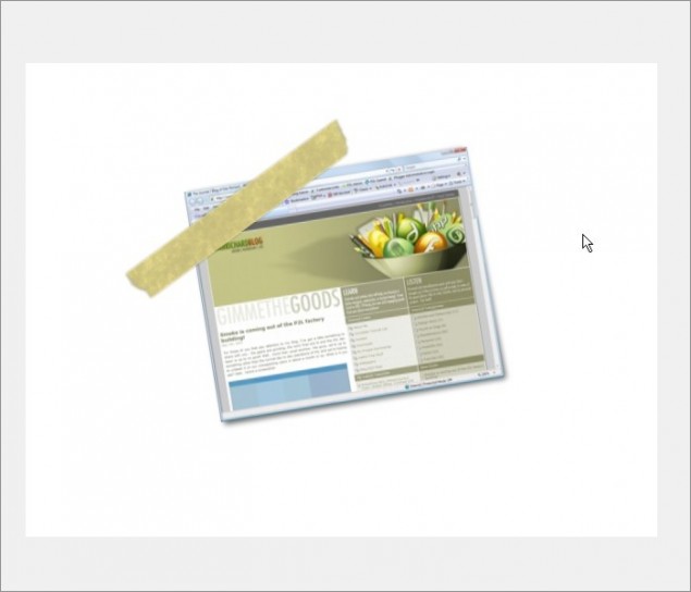
Step 19 – Click and hold the bottom right rotation arrow and drag your mouse upwards and you’ll see your image rotate. Once you’ve reached an angle you like, release the mouse button and right-click and press apply.


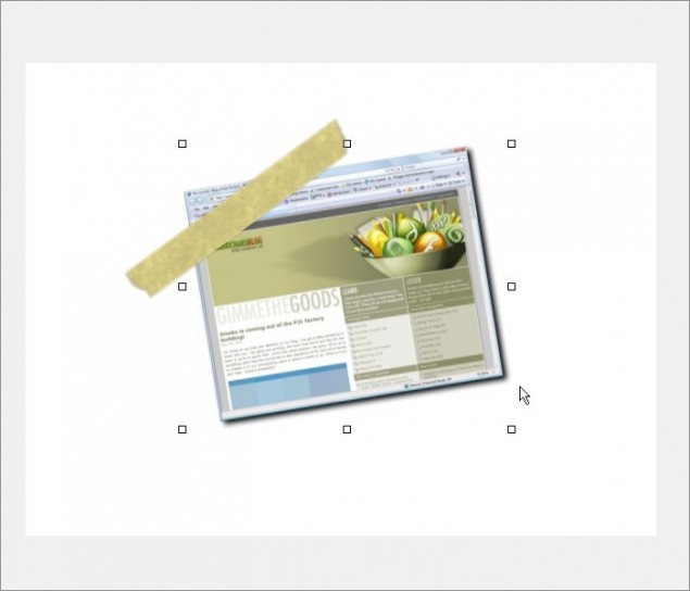
Step 20 – Repeat steps 18 and 19 on the masking tape object and place it on top of the image:

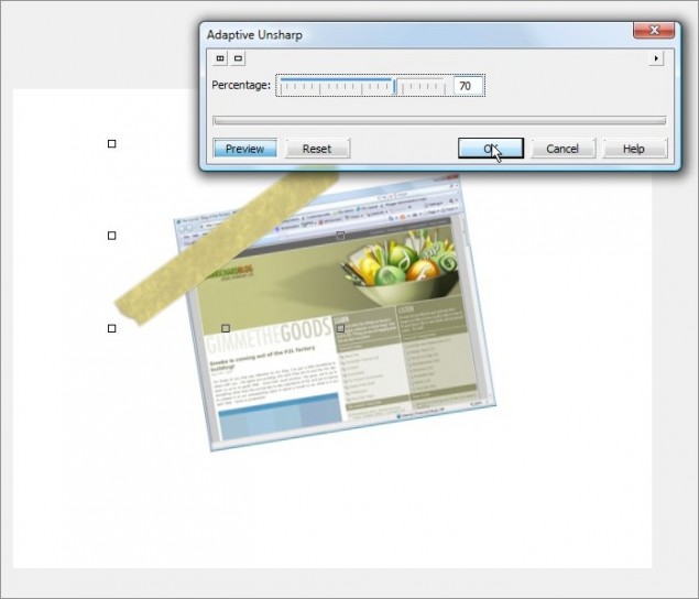
Step 21 – You may have noticed that when we rotated the tape, it got a bit bit blurry on us. No worries, we can sharpen that up again by applying an Adaptive Unsharp at around 70% – 100%:

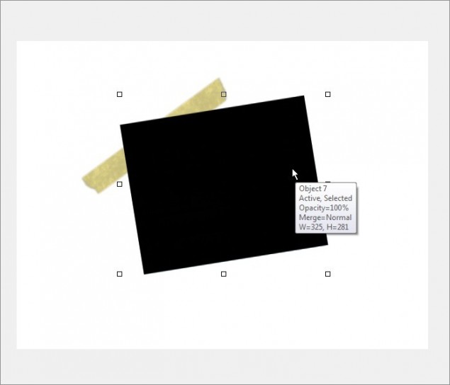
Step 22 – Next up, we’ll add a bit of a 3D element to this effect by adding a shadow to the image. This will make the image look as though it’s slightly lifted off the background where it’s not taped down. Do a copy/paste of the pic so that we now have a second copy of the image object layer and once again, turn the brightness of the object all the way down to black:


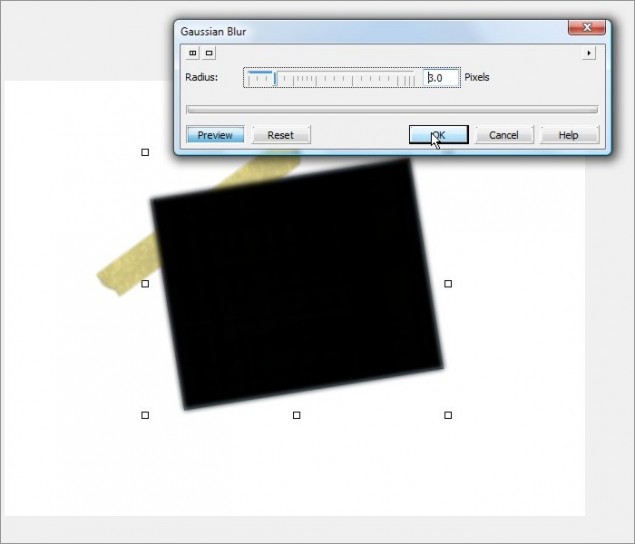
Step 23 – We’ll want this to be a blurry shadow, so apply a Guassian Blur with a radius of 3 or 4 pixels:

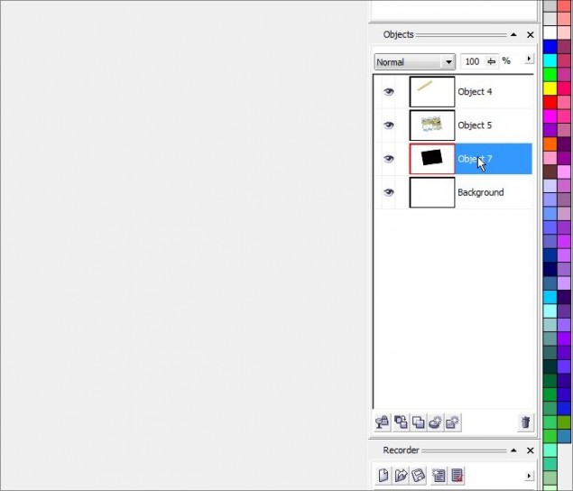
Step 24 – Now move the shadow object layer all the way to the bottom of the Object Docker:

Step 25 – We can now get our shadow layer in to the correct position. Hit the down arrow on your keyboard 3 or 4 times and then hit the right arrow button the same number of times:

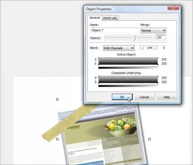
Step 26 – Our shadow is a bit too dark and demanding, so let’s tone that down by lowering it’s opacity to 60%:

Step 27 – This next step is a bit tricky… Seeing as the effect we’re after will make the image appear to be lifting off the background as we get further from the tape, it’s only logical that the shadow would be smaller as we get closer to where the tape is holding down the image. So this means we need to reduce the amount of shadow we see at the top.
Click on the shadow until you see the Free Transform Arrows show up at each corner of the image (don’t confuse these arrows with the Rotation Arrows):

Now click and hold on the top right arrow and slowly drag your mouse to the left maybe 10 pixels or so and release. You’ll see that the shadow has now moved inwards at the top:

If you’re happy with the results, right-click and click on Apply:

Our shadow is done!

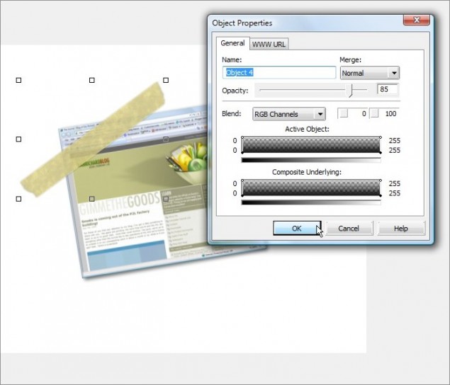
Step 28 – And for the FINAL touch of realism, we’ll make the tape SLIGHTLY transparent by clicking on the tape object, opening the properties, and setting the opacity to 85% – 90%:

And we are done like bacon! Add some text and whatever other elements you want and you’ve got yourself some realistic masking tape holding up a picture on your website.

Thanks for reading, please make sure to leave a comment below or share this tutorial!
Dan


