Browsed by
Category: Tutorials

Action Blur – Give static photos a sense of motion and action

Action Blur – Give static photos a sense of motion and action

Today’s tutorial is a rather simple effect that I’m sure pretty much anyone has seen, either as a Photoshop tutorial, or an effect used on a poster or some other form of printed media. It’s a simple but very effective way to add some dynamic motion or action to an otherwise fairly static and boring image. The tutorials I’ve seen for this trick all use the radial blur in Photoshop, so I thought I’d whip up a quick tutorial for the Corel PhotoPaint minority out there. We’ll basically need to do some tedious masking and run a filter and that’s the end of it. Nothing strenuous here folks!

Before we go any further though, I just want to point out that this tutorial has a few extra steps involved that what is truly necessary. I’m going to be masking and copy/pasting new objects as I work through the tutorial. Those steps aren’t really necessary, but if you plan to do some photo manipulation once you’ve applied the blur, you’ll need the background and object on separate layers. If you just want to create the effect without all the steps, just mask off the object, invert the mask and then apply the blur.

But hey, I like to complicate things, not to mention it’s my tutorial 😉

Let’s get started!

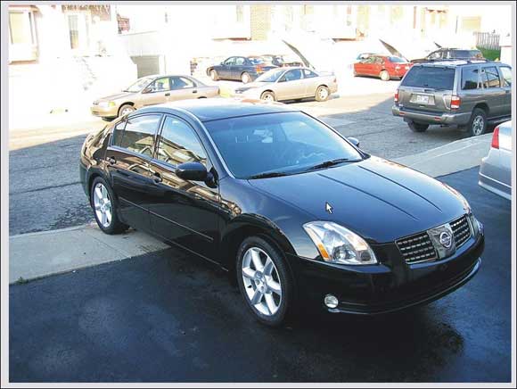
For this tutorial, I figured why not apply this filter on a Photo to create something you see quite a bit. A car ad! So just for this tutorial, I grabbed my digital camera, opened the front door and snapped a photo of my car. This just goes to show you how you can apply this to pretty much anything you want.

So here’s our photo:

STEP 1 – Creating the mask
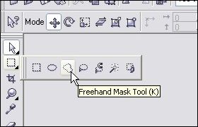
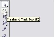
A) First thing we need to do is create a mask around the car so we can start duplicating the foreground and background areas to apply the blur. So go ahead and select the Freehand Mask Tool from your toolbar or simply hit ‘K’.

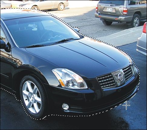
B) Zoom right in (300% or more) and click on the spot when you want to start your mask. In the case of this tutorial, I started the mask on the back of the rear left tire and I’m going to work my way around the car clockwise.

Now you have two ways to use the Freehand Mask Tool, and it really doesn’t matter how you decide to do it. Just use a technique you’re comfortable with. Method 1 involves the truly freehand method. Click and hold the left mouse button where you want to start your mask and then start to move the cursor around the edge of the object. The mask will draw itself as you move around the edges. To stop drawing the mask, release the button and you can move the mouse freely without drawing the mask. Click back down again to start drawing the mask out from where you left off. When you’re done, double-click the spot where your mask ends (should be right next to where you first started) and the mask will close itself and you should now have a complete mask around the object.

Now, I personally hate this method and feel that you have to have the steady hand of a neurosurgeon to pull it off. I definitely use method 2 unless I”m in a huge rush and don’t care if things get sloppy.

Method 2 is essentially the same thing as method 1, except rather than drawing the mask with your mouse, I click my way around sort of like a game of Connect the dots. I click on the spot where I want the mask to start, move to the next spot and click again to join the two points together. It’s a slow way to do it, but it’s precise. The more curves you have, the more you have to click to keep those curves smooth. When you’re done, double-click the spot where your mask ends (should be right next to where you first started) and the mask will close itself and you should now have a complete mask around the object.

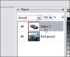
STEP 2 – Let’s add the car to it’s own layer now that we have it all masked off. Hit Ctrl-C then Ctrl-V to copy/paste the masked off portion as a new object. You can see in the object docker that we now have a background layer and new object layer with the car in it.

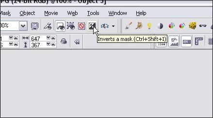
STEP 3 – Next we will need to clean up the new car object layer slightly and then add the background we want to blur to a new layer. Click on the Invert Mask button on your toolbar or hit Ctrl-Shift-I.

STEP 4 – When I pasted the car as a new object, my cursor changed to the Object Picker tool, but we still need to make changes to the masked area, so select your Freehand Mask Tool icon again.

After you’ve selected the mask tool, hit Delete and this will clean up the edges of the car object layer. When you invert a mask, the mask itself moves a couple of pixels over onto the object you had masked off initially. When you delete, you’re cleaning up a 2 pixel edge or so. To see what I’m talking about, zoom in to the edge of the car and hit Ctrl-Z to undo the delete. You’ll see the edge that you are removing with this step.
So once you’ve cleaned up the object’s edge, move on to the next step!

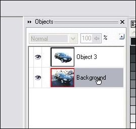
STEP 5 – Click on the background layer on your object docker.

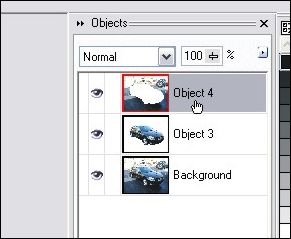
STEP 6 – Hit Ctrl-C then Ctrl-V to copy/paste the background we want to blur as a new object. You?ll see a third layer has now appeared on the object docker:

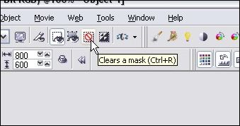
STEP 7 – Remove the mask by clicking on the Clear Mask button or just hit Ctrl-R.

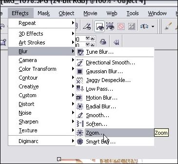
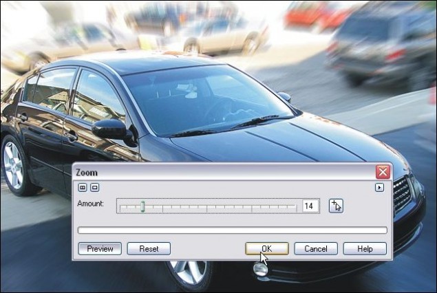
STEP 8 – Time to run the blur! Click on Effects > Blur > Zoom and play around with the blur intensity until you find a setting you like. Here’s my settings:

All done!

Your boring photo should now have an optical effect that provides action or motion to the overall feel of the image. Add text and some other effects and you can put yourself together a nice little ad and start selling your car (Or your parents’ car) 😉

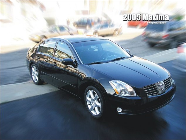
Here’s the final result without any playing around:

Hope you enjoyed the tutorial, please feel free to use the buttons below to share or comment on this tutorial!

Dan
Slicing and Coding a Content Box in Photopaint and Dreamweaver

Slicing and Coding a Content Box in Photopaint and Dreamweaver

This is one of my first tutorials I ever wrote a couple of years ago, and it’s quite popular because so many new designers fine using tables to be confusing for layouts. Now I know the latest craze is pure CSS layouts, but I’m old school and still use tables. So, this is a concept that is a bit confusing for the new DreamWeaver users. I will show you how to slice up a basic content box and use DreamWeaver to create the tables and format the box to accept content without displaying a mess whenever the content is too much or the size of the browser window is changed etc…

First off, I will use Corel Photopaint to slice up the content box, but you can certainly do this in any graphics program, including Photoshop or even MS Paint.

Here is the content box I made:

As you can see, this is a very basic content box with a header, footer and content area. For a HUGE and very complete guide to slicing, check out my massive slicing tutorial guide at www.slicingguide.com, which shows you step by step how to slice up an advanced layout. This tutorial is so big, it’s basically it’s own website!

If you’re new to slicing and using Dreamweaver, then start off with this simple concept tutorial, then move on to more complicated adventures is slicing land.

We will need to cut the box up into 3 sections… a top piece, middle section and bottom piece. I’ll start by masking the top section, copy it to clipboard (copy or ctrl-c) and create a new document from the clipboard.

We’ll name this header top.gif (click to view)

Next we do the same thing to create the middle graphic.

Name that middle.gif (click to view)

Last we do the same for the footer graphic…

Name that bottom.gif (click to view)

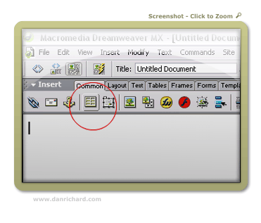
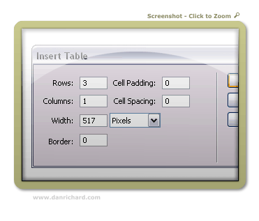
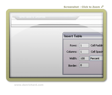
So now we have our 3 sections of the content box, time to load up DreamWeaver. Create a new document and start by creating a new table with the following settings:

For the width, you should put the width of the actual total image length. So for this content box, I know that it’s 517 pixels wide, so that will be the table size.

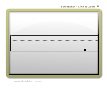
You should end up with a new table that looks like this:

We now have 3 rows to fill up. Click on the top row (Just click once anywhere in the row itself and you’ll see your cursor blinking in the row). Let’s insert your top.gif by clicking on Insert > Image and browse to the image you want and double click it. Top.gif should now be in the top row of your table.

Now click on the bottom row and do the same thing for bottom.gif

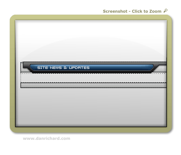
You now have this:

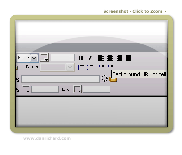
Now we insert the middle portion so that it fills up the middle portion properly as your tables changes height depending on content. Click on the middle row like you did the others. On the properties bar, click on the folder icon marked as “background URL of Cell”: (If you don’t have a properties bar, click on Window > Properties on the main menu to open it.)

Browse to your middle.gif and double-click to select it and voila! You now have the center row with the middle.gif set as the background image so you can write whatever you like, insert images etc…

Now to add some content. You can go ahead and type stuff or add images to the middle row as is, but the text will be jammed right against the edge and won’t look to hot. So we can create a table inside that row with a bit of padding to keep the content off the edges of the box. Once again, click the middle row so that your cursor is in it and click the new table button. Use the following settings:

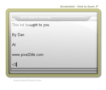
Hit ok and you can start adding your content to that new padded table. Your box should now look like this:

Hope that helps clear up some of the DW slicing mystery 🙂

Dan

Please be sure to check out my complete tutorial list for more great articles!

Realistic Frozen Ice Text Effect in Corel Photopaint v12

Realistic Frozen Ice Text Effect in Corel Photopaint v12

This tutorial was actually not intentional, but is merely some screenshots I took trying to figure out this effect. I had to make a logo for someone with “Icy” text and I hated the ones for Photopaint. They didn’t look like Ice at all… so I made my own. As I experimented with different effects I was mimicking from various Photoshop tutorials, I took screenshots as I went along so I could remember what I did. I finally found a combo of effects that resulted into some decent looking ice, so here’s a tutorial based on my “screenshot notes”.

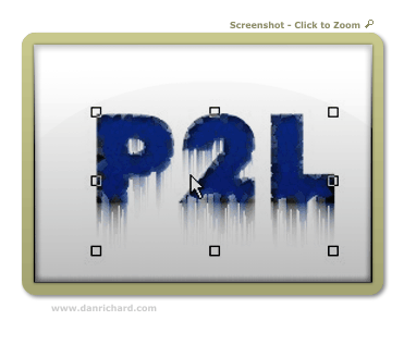
Here’s the final result we’re aiming for:

user posted image
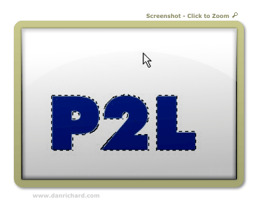
 Step 1: I’ve noticed that the bigger the text, the better this looks. I managed to pull it off on some pretty small text by playing with the filter settings, but for this tutorial, we’ll deal with some decent size text. First start out with a darkish blue font color and use a nice thick font like this:

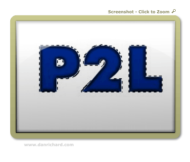
Step 2: Create a mask around the object by hitting ctrl-m

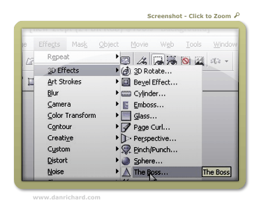
Step 3: We’ll start by running a built in 3D Effect called “The Boss”. Here is where it’s located and the settings I used:

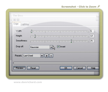
The Boss – Edge Settings:

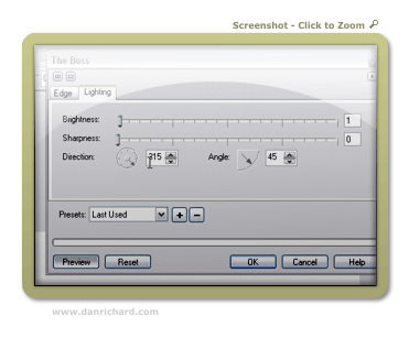
The Boss – Lighting Settings:

Here’s the final result of that effect:

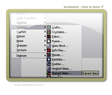
Step 4: Now we’ll need to apply a filter of some sort that will add texture to our ice. I’ve found that the stain glass filter works the best. You can find that here:

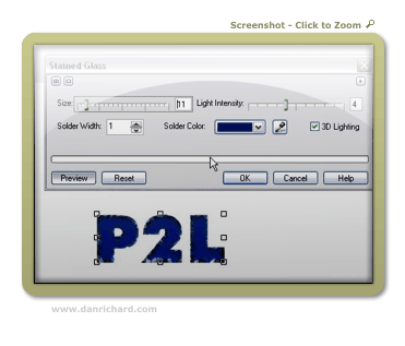
Use these settings and you can see what you get:

Step 5: After you have applied your stain glass settings, make a duplicate of the object we’re working on copy/pasting a new one. You should now have two objects in your object docker – both the same text with our effects. Click on the top object and proceed to step 5.

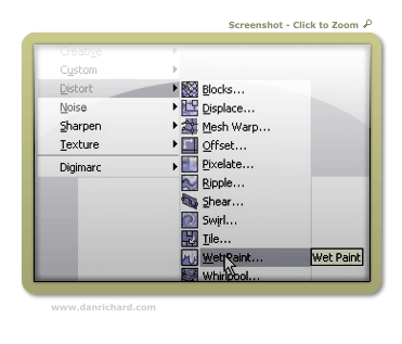
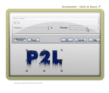
Step 6: We’re going to run the wetpaint filter on the top object so we can have some icicles on our text. You can find that effect here:

I used the following settings and got this:

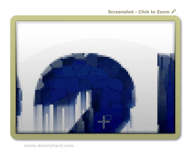
Step 7: Now we have a small issue… the top of the text has “icicles” running down the front. We don’t really want that in there – there should only be icicles hanging off the bottom. So grab your mask or eraser tool and cut away the unwanted parts of the wet paint effect. You can see in this example that I’ve removed the icicles off the top of the “2” but there are still some that need to be cut away on the inside left portion:

Once you have it all cleaned up, you’ll have something like this:

Go ahead and combine the two objects by selecting them both in the object docker (hold shift and click on each object) and hit ctrl-alt-downarrow

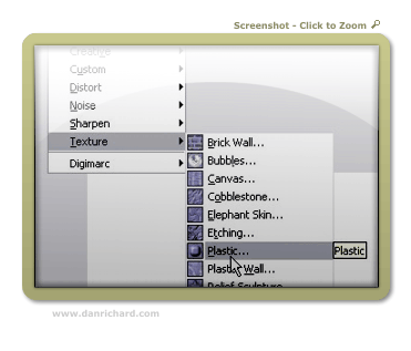
Step 8: Now things start to look like ice! We apply the Plastic texturing effect, which can be found at:

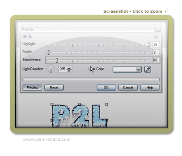
Here are my settings and the results:

Step 9: You’re done! Now we add a dropshadow and some text for the sake of showmanship and voila! Iced text by Faken.

user posted image

Comments welcome!

Dan
Please be sure to check out my complete tutorial list for more great articles!

Brushed Steel Interface with Glass Button in Photopaint v12

Brushed Steel Interface with Glass Button in Photopaint v12

Well the Corel tutorial section is looking a little quiet, so I figured I’d better start adding some meat to the bones 🙂 As some of you know, I like to “translate” Photoshop tutorials for the Photopaint people, and I usually do tutorials based on effects that P2L visitors request from me directly. In the last month or so, I’ve received a few requests on how to draw those metallica interfaces with the plastic or glass buttons. So in this latest tutorial, I’ve combined two pupular effects to generate a glass button set into a brushed steel interface background.

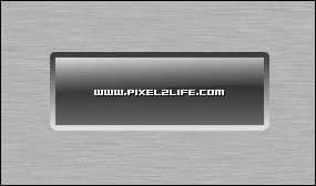
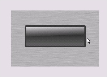
Here is the final product we’re going to create:

As you can tell, it’s fairly basic, but this will give you the foundation to produce more complex peices. Feel free to experiment with the various settings as you go to produce different effects.

Step 1:

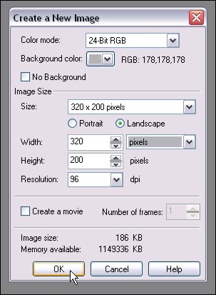
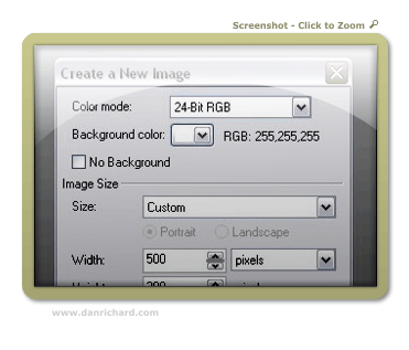
We start of by creating a new document. Now bear in mind that when we use this method, the brushed steel will end up being the background. If you decide that you want the background to become another layer, you can do so at anytime by clicking on Object > Create > From Background. Here are the settings I used for this tutorial:

Step 2:

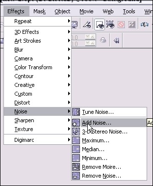
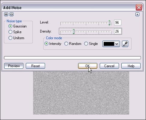
We’ll start off by adding some noise to the background. When we distort the noise, that will create the brushed look we want. So we run the filter by clicking on Effects > Noise > Add Noise.

Here are the settings I used (NOTE: If you increase the density, the darker your “brushed” look will become. These settings will keep the look fairly light):

Step 3:

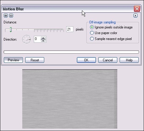
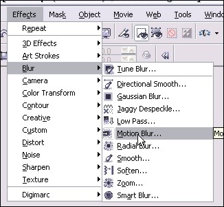
Next we’ll add a motion blur to create the brushed look of our steel. You run that filter by clicking on Effects > Blur > Motion Blur

Here are the settings I used:

Step 4:

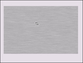
After you’re applied the motion blur, you’re going to have uneven shading on the edges (As you can see in the preview pic in step 3). We’ll get rid of the by cropping the image so we only have the even area left. Hit D for the crop tool and select the area you want to keep. Release the mouse button and double click inside the area you want, and that will crop out the outside area. You’ll end up with this:

Step 6:

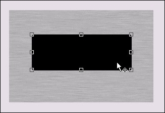
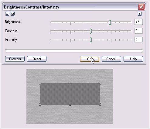
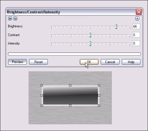
Now hit ctrl-c then ctrl-v (Copy and Paste) to create a second black square over the first one. We’ll adjust the brightness a bit to add some flavor to our button. Click on Image > Adjust > Brightness/Contrast/Intensity and use these settings to brighten up that second box a bit:

Step 7:

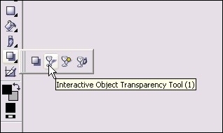
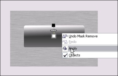
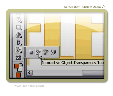
Now we’ll start adding some gradient type effects with one of my favorite tools, the Interactive Object Transparency Tool, which you can activate by hitting 1, or from your main toolbar:

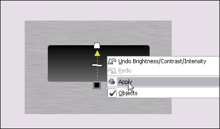
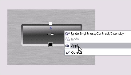
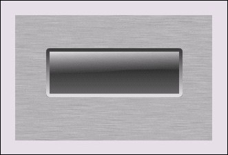
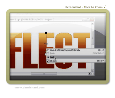
Here’s how to use it: Put your mouse pointer at the bottom of the rectangle and click and hold the left mouse button. Move your mouse tot he top of the rectangle and release it. You can now see we’ve created a gradient type transaprency. Right click on the rectangle and click apply. Here’s how it looks once you’ve right clicked to apply the transaprency:

Step 8:
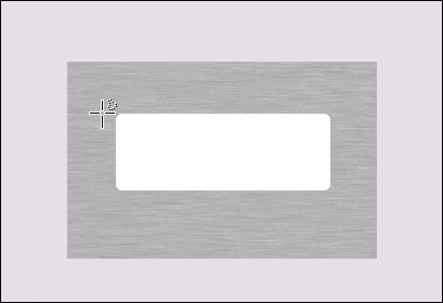
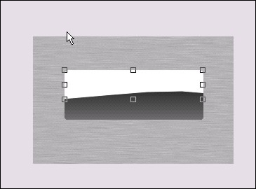
Next we’ll create the “shine” of the glass. Hit ctrl-v and once again you’ll have another black rectangle over your button. Repeat the brightness step in Step 6, except increase the brightness 100% so that your rectangle is now white. You’ll end up with this:

Step 9:

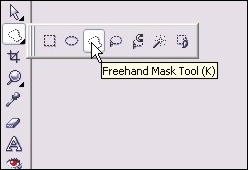
We’ll need to cut that white square a bit to give that nice classic glass shine effect, so from your main toolbar, select the Freehand Mask Tool or simply hit K:

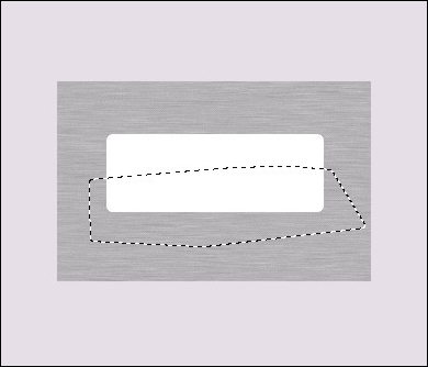
Now starting on the left side of the white square, click the left ouse button to activate the mask. Move your mouse to the right and click again to activate a mask point. Keep moving to form a rough rectangle around the botom half of the rectangle, and click once each time you change direction. Double-click to finish the mask and you’ll end up with this:

Hit the delete key and the section you masked off will be cut away and look like this:

Step 10:

Once again grab your Interactive Object Transparency Tool and repeat step 7 for the white half rectangle, except start from top to bottom rather than bottom to top. You’ll end up with this:

Step 11:

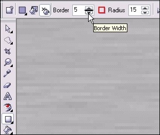
Now we’ll add a border to the glass button to give that inset effect. Select the rectangle tool again and you should still have the settings from when you created the initial black square. In the settings for the rectangle tool, turn outline on and turn fill off. Change the border setting to 5 pixels. Be sure to select a dark outline color (I used dark grey) Here’s a shot of the rectangle settings I used:

Now zoom in to your current button and draw a new rectangle over top, exactly the same size. The curved corners should line up exactly the same and you’ll end up with this:

Step 12:

Once your rectangle outline is done, do another copy/paste (ctrl-c and ctrl-v) to create a duplicate copy. Once again adjust the brightness for the second outline following the steps in step 6. Here are the brightness settings I used:

Step 13:

Again we use the Interactive Object Transparency Tool and repeat step 7 to fade the two outlines together. Here’s how it should look:

Step 14:

As the dust settles… your project at this point should look something like this:

Step 15:

Add some text and other details (Shadows, additional shine etc…) and you’re done!

Please post any questions or comments on this tutorial 🙂
Dan
Text Reflection – Advanced Text Reflections With A 3d Perspective and Effects in Photopaint!

Text Reflection – Advanced Text Reflections With A 3d Perspective and Effects in Photopaint!

Software: Corel Photopaint v11

It’s been a little while since my last Corel Photopaint tutorial simply because of the sheer volume of work I’ve experienced with the Pixel2life version 2 release AND the increase in submissions, but I’ve set aside a few minutes to put out something new for the minority crowd of Corel users. One of the tutorials I’ve seen the most lately for Photoshop is how to create a text reflection, so obviously this is a pretty popular effect that people are looking to do. I’ll admit right now, this is a boring effect that takes about 3 seconds to figure out, and quite frankly I think anyone who knows how to write text in Photopaint can figure out how to flip it over and make a reflection. No rocket science there. BUT what I don’t see is a few of the subtle tricks that help give the reflection that added 3D look and feel, along with a few other simple built in filter tricks to jazz things up a bit.

So today we’ll cover a basic text reflection effect along with added 3D perspective touch-ups and finally, some small filter tricks to liven things up a bit. Anyone and their monkey can create a simple reflection, so lets try to spice it up a bit shall we?

Here’s what we’re going to make:

user posted image

*Puts on his glasses and bowtie and strikes a grandiose pose, chalk in hand*

Shall we begin?

Part 1 – Creating Gradient Text Without a Gradient Fill!

First things first, we’ll create our basic reflection with some nice pseudo gradient text. You can skip the gradient stuff and just use a single color text, but at least this will give you some experience with some of the nifty tools in Corel Photopaint. I probably use the Interactive Object Transparency Tool every time I open Corel, so naturally you’ll see me use it in a tutorial.

Step 1: Start up Corel Photopaint and create your new document. Here’s the settings I used for this tutorial:

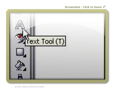
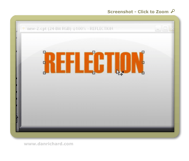
Step 2: Select your Text Tool from your toolbar (or hit T) and type out the text you want to use in whatever font you desire. I tend to use thick fonts for these effects so that my filter effects stand out better, but it’s totally up to you. Pick a nice bright color for your fill… I’ll use good ol’ orange!

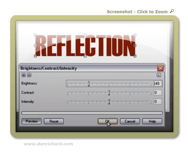
Step 3: Once your text is typed out, switch to the Object Picker Tool by hitting O and then create a duplicate of your text by hitting Ctrl-C (Copy) and then Ctrl-V (Paste). This will create a second set of the text. We’ll start creating our gradient text so click on Image > Adjust > Brightness/Contrast/Intensity and darken your text up a bit. Here’s the settings I used for a dark orange tone:

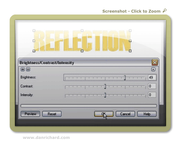
Step 4: Now create another set of that text by hitting Ctrl-V (paste), and then once again load up the Brightness/Contract/Intensity Tool and lighten that text up to a brighter orange tone. I’m uses these settings:

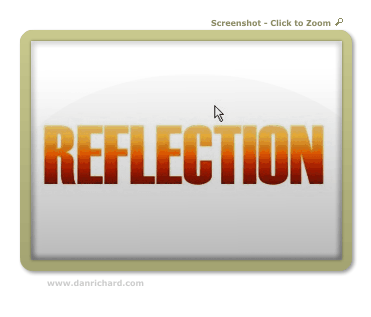
Step 5: Zoom in a bit and we’re ready to start our fake gradient effect! Now I know we can do this by creating a gradient style fill like in my orb tutorial, but this will help get you used to that wonderful Interactive Object Transparency Tool I mentioned.

So now now go ahead and select the Interactive Object Transparency Tool from your toolbar!

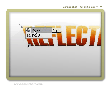
Step 6: Move your mouse cursor to the top of the text and click and hold down your left mouse button. That will lock where you want the solid part of the object to start. Next, drag your mouse downward and select where you want the object to end. When you’ve decided where the transparency should finish, release the left mouse button. If you’re happy with the preview, right click on your canvas area and click apply. If you don’t like it, hit Esc to start over.

Here’s the tool in action:

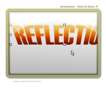
After I clicked Apply:

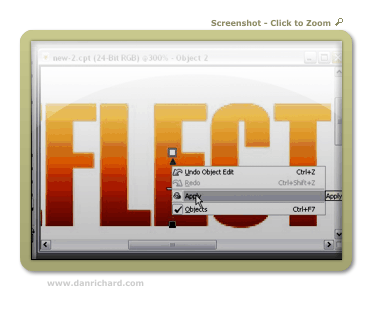
Step 7: Repeat step 6 for the darker text. First go to your object docker (If it’s not open, hit Ctrl-F7) and select the dark text object. At the moment you should still be on the light one. Once you’ve selected the dark text object by clicking on it in the object list docker, use your transparency tool again, but start from the bottom and go up instead of vice versa.

In action:

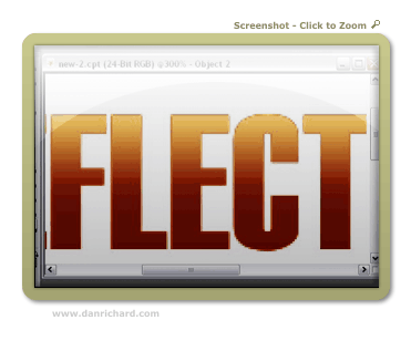
Final result:

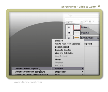
Step 8: Now we’ll need to combine all 3 text objects together and make them a single object layer. Just hold down Ctrl and click on each text object in the Object docker to highlite them and then right-click on one of them and click Combine > Combine Objects Together.

Once you’ve completed this step, you should now have your 3 color gradient text all in a single object.

Part 2: Playing with Perspective!

This step goes beyond your average reflection tutorial effect in the sense that we’ll play with the perspective to give this version some depth. The beauty of this effect is that you can play around with all kinds of versions. In this case, we’ll add a perspective to both the text and the reflection, but you don’t have to confirm to what I’m doing. You can apply the perspective to the text and NOT the reflection or do it the other way around and only apply a perspective effect to the reflection only. Or you can bypass the perspective twist altogether and leave everything straight up.

What exactly is perspective? Perspective is used in 2D images to give a sense of 3D depth. In the case of this tutorial, we’re going to bend text to appear that we’re looking at it from a top perspective. By changing different angles, we can completely change the overall perspective to suit just about any angle. Play around and see what you can come up with!

So let’s get crackin!

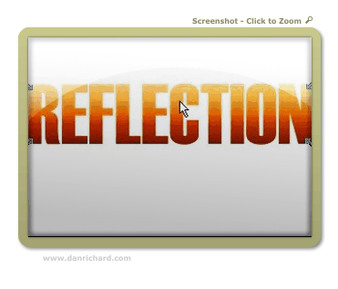
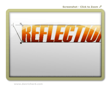
Step 9: Activate the Object Picker again by pressing O and then click on the text object 3 times. On your third click, you should see double arrows angled at 45 degrees on each corner of the object. If you don’t see those arrows, just click on the object until they come up. You should see arrows that look like this:

Step 10: Click and hold the arrow at the top right and drag it to the right to angle the top corner outward. Release the mouse button and your angle will be set. Now click the top left arrow and drag it to the left. Release when you have an angle you want to use.

If you’re happy with your changes, right click on the object and click apply. If you want to start over, hit Esc.

Once you click apply, your new perspective angles are applied to the object:

Part 3: Create the Reflection!

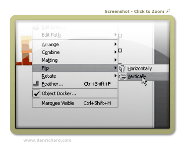
Step 11: Now we’re ready to create our reflection and play with some effects! So first hit Ctrl-C (Copy) then Ctrl-V (Paste) to create a copy of our text object. Once you have tha done, click on Object > Flip > Vertically.

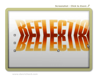
Step 12: Use your mouse to click on the “upside down” text and drag it so that the top of the “upside down” text lines up with “right side up” text. You can choose to have the two objects touching, or try it with a little gap between the two. With a space, it’ll look like the object isn’t quite touching the “reflective surface”. For this tut, I made it touching…

Step 13: For an added effect, we’ll have our reflection fading out as it gets further from the object. You can leave it completely intact if youw ant, but I like it better this way. So take out the good ol’ Interactive Transparency Tool again and starting from the top of the reflection, fade it out at the bottom.

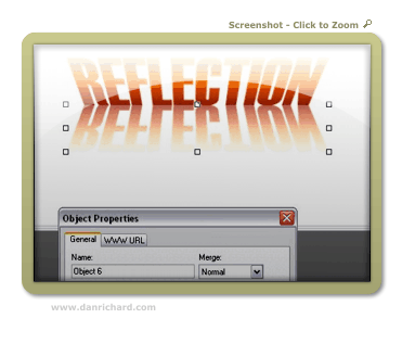
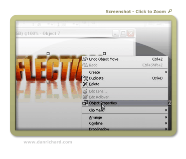
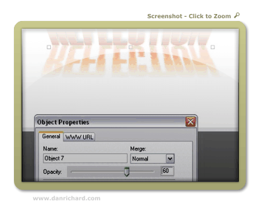
Step 14: You may feel that the reflection is still a bit too powerful, so we’ll tone it down a tad. Right-click on the reflection and click Object Properties. In the box that opens, lowe the opacity to tone down our reflection. I set mine to 60%:

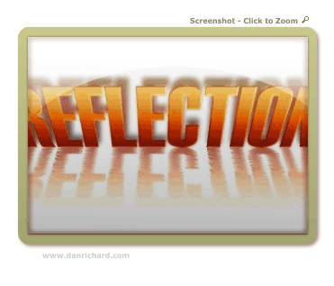
And now our reflection is done! You can quit while you’re ahead or we can play around a bit with the built in filter effects and jazz up our reflection a bit more! If you’re feeling brave, here’s some tricks I used to acheive the final image! (Don’t you hate tutorials that show you a “final image I made” but don’t show you how exactly they did it?).

Part 4: Playing with Filters!

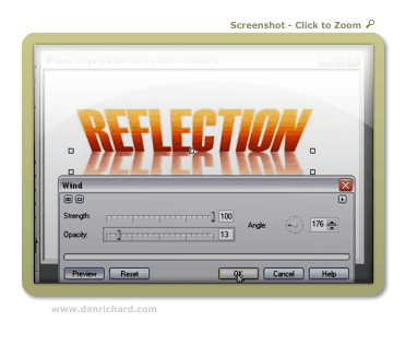
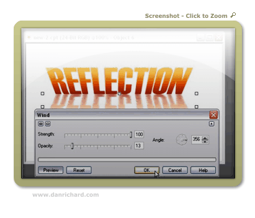
Step 15: If you’ve ever seen a reflection in water, it’s not always a perfect pane of glass type of reflection… it’s usually rippled with a bit of distortion. Well we can easily achieve this with the Wind effect! Make sure you’ve selected the reflection object with your Object Picker and then click on Effects > Distort > Wind. We’re going to distort both to the right AND left for this effect, so here my settings for the two times I ran the filter:

First pass goes towards the left (Note the angle dial):

Second pass goes right:

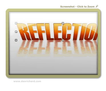
And you’re done your rippled reflection!

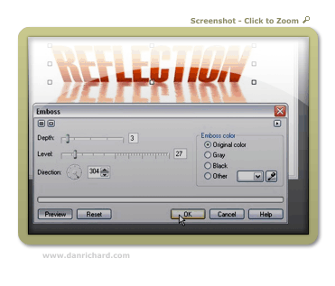
Step 16: Let’s increase the 3D look of our initial text shall we? Select the main text object with your Object Picker and then click on Effects > 3D Effects > Emboss. Play with the 2 sliders to see what it does to your image! Here are the settings I used:

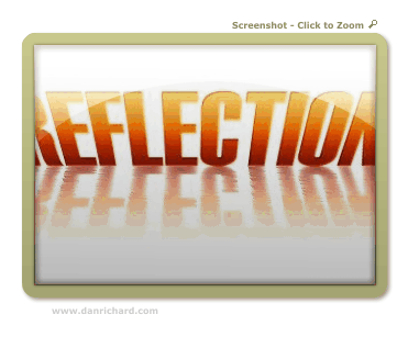
Here’s how our reflection is looking so far:

Step 17: Shall we add some shadows to our artwork? Well it certainly won’t hurt to acheive additional depth to our image! We’ll need to create another copy of our text, so once again, hit Ctrl-C (copy) and then Ctrl-V (Paste).

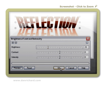
Step 18: As we did in step 3, load up the Brightness/Contrast/Intensity adjustment tool and darken our new text object. Here’s the setting I went with:

Step 19: Now we need to move things around a bit in the object docker so that the dark text is in the background. Click and hold the dark text object in the Object Docker and move it down so that it’s under the first text object layer. This will move your dark text behind the brighter one like this:

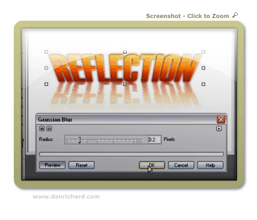
Step 19: Let’s add a little bit of a blur to our shadow. Click on Effects > Blur > Guassian Blur and apply a small bit of blur. You can play around with different settings, but I usually use a blur of 1 to 3:

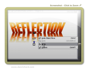
Step 20: Use the up arrow on your keyboard to move the shadow up a few pixels, or just drag it up slightly with your mouse:

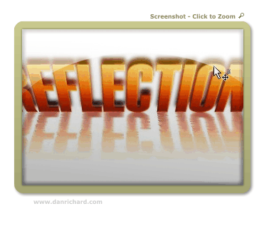
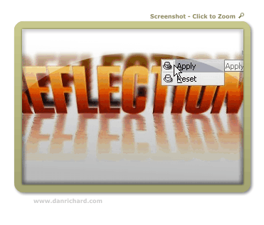
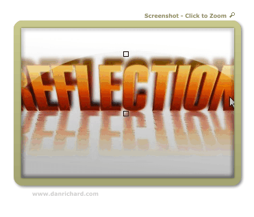
Step 21: More perspective? Well, it’s not necessary but I figured a bit of a perspective change on the shadow would add some “Je ne sais quoi” 😉 So once again click on the object until the perspective arrows show up and then drag the upper corners to the desired angles. Here’s how I did it:

Step 22: After I applied my new angles, the shadow was a bit too high, so I moved it down about 4 pixels… just being picky I suppose. Here’s where things are at:

Step 23: Once again we can tone down the shadow by right-clicking on the object and clicking on Object Properties:

I turned down the opcity to 60% for this tutorial:

And now we have this:

Step 24: One last little tweak just for the heck of it! I want to increase the contrast between the top and bottom of the text that’s being reflected and keep my reflection the same. This theoretically would increase our 3D look even more!

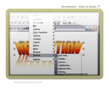
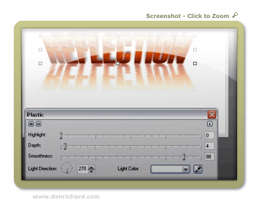
So click on Effects > Texture > Plastic

Playing around with the settings will give you LOADS of different looks… here’s what I went with:

And VOILA! Here is our final image!

user posted image

I hope you enjoyed the tutorial, and please feel free to post comments or questions!

Thanks,
Dan
Please be sure to check out my complete tutorial list for more great articles!