Browsed by
Category: Design Work

P2L Launches new company portal website for professional services!

P2L Launches new company portal website for professional services!

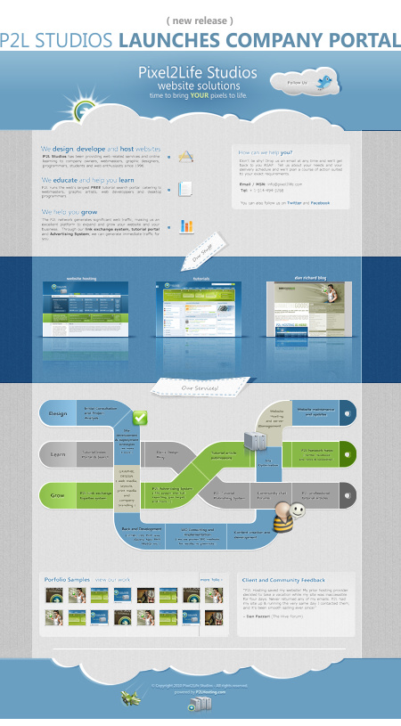
Hello everyone!  Just wanted to show you guys the new website I designed for the official P2L Studios company page.  I wanted to start getting back in to freelance but I didn’t have a portfolio online anymore, plus I wanted to showcase all the services provided by the P2L network so I figured it was time to put the P2LStudios.com domain to good use.  Here’s the new layout:


The layout was built from scratch in Corel Photopaint X5 but I would like to thank the folks at wegraphics.net who published a GORGEOUS website layout tutorial for Photoshop that obviously inspired the layout I did.  I saw the tutorial at least a month ago when it was submitted and right away I thought it was amazing and wanted to create something similar for one of my sites.  I don’t use Photoshop so I couldn’t really follow the steps of the tutorial, plus I didn’t want to copy it exactly so I tried to look at it only a few times and added my own little touches.  So thanks guys, amazing tutorial and I am in love with the final result.

I also designed the little info graphic that shows the P2L services.. that was inspired by a board game my daughter had in my office and thought it would look really cool as an info-graph.  Very happy with the final results, hope you like it as well.  Please check out the site at www.p2lstudios.com and let me know what you think!

Dan

PS. I also need to send a HUGE thanks to Adam and Nick for coding the site for me, thanks so much guys!

The AMAZING Artwork of Tiago Hoisel!

The AMAZING Artwork of Tiago Hoisel!

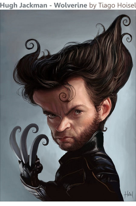
What exactly is the deal with everyone named Tiago having a ridiculous amount of creative talent? Officially, 100% of the Tiagos I know are AMAZING artists or designers of some sort… ok so I only know 2 guys named Tiago, but 100% is 100%. So today I want you guys to meet the awesomeness that is Tiago Hoisel.

Hugh Jackman - Wolverine by Tiago Hoisel


Tiago is a young man at 24 (he hits the quarter century mark in a couple of months) and resides in São Paulo, Brazil and is already developed some AMAZING graphical skills, producing some fairly jaw dropping caricatures and paintings. Please visit his personal site at hoisel.zip.net or you can check out his CGSociety page at tiagohoisel.cgsociety.org and bring something to clean the drool. I noticed he was recently featured on Digg, so he seems to be attracting a huge audience right now, and he deserves it. So congrats Tiago on all your current and future success, keep up the awesome work!

Enjoy all!
Dan

Fun with Backdrops – Something to try with your camera!

Fun with Backdrops – Something to try with your camera!

Hi all!

Phew, I have been MAD busy with P2L and the Predatorstuff.com website (AvP-R was recently released in theaters so everyone has Predators and Aliens on the brain), but I hope everyone had a great Christmas and I wish you and your families all the very best in the new year. I would especially like to thank the P2L crew for all of their very hard work in the past year and I look forward to working with you guys in 2008! We’ve got a lot in the planning so it should be quite the summer.

Anyhow, I wanted to share with you guys a fun little experiment I did this morning for a photo review… I wanted to try something with small detailed backdrops on one of my kits and I think it came out pretty sweet so I thought I’d share this with you photography buffs to try it out. Here’s how it turned out:

You can check out the rest of the pics from this experiment in the Predatorstuff Gallery.

It was a fairly simple trick, but I love how dramatic it looks… first thing you need to do is find your backdrop images. I went on DeviantArt and did a search for “1920×1200″ and it showed me a list of TONS of high resolution wallpapers and artwork. I picked out a few that I liked and printed them with my inkjet on some Cannon Matte Photo Paper (It’s important to use a matte finish, not glossy or high gloss or you’ll get shines and reflections from your lights) with my borderless printer. I let them sit for about 30 minutes to ensure they dried completely and I started to set up by photography table, light tent and lights. I then placed a light at the back of the tent and pointed it forward towards the camera. I used a clamp to position the printed backdrop upright directly in front of the light fixture and you immediately get this cool backdrop effect where the darks stay black and the lighter areas of the print out are glowing brightly with clean diffused light. Then I just place my kit in front of the backlit backdrop and it’s photo time!

The only limitation is that by printing on a 8.5″ x 11” you only have a tiny backdrop, so I couldn’t get complete kit shots, but I managed to pull off some very nice close-ups. The end result was the Predalien standing in front of a fire or explosion in a very natural looking photo without any post editing in Photoshop. Why mess with photo editors if you can do it straight with the camera?

Anyhow, that was my little experiment today and I thought it came out pretty cool… I’ll need to order some large prints from DeviantArt so I can have larger backdrops and use them to photograph larger pieces. Give it a try to spice up your photos, it’s a fun way to spruce up your product and macro shots.

Dan

New Tutorial on Cracked Text and Photos, New Splash for a Friend, Rescue Me and v5?

New Tutorial on Cracked Text and Photos, New Splash for a Friend, Rescue Me and v5?

Hey guys! There’s been quite a bit of activity lately and I’ve been sort of dabbling in all kinds of spots… So here’s a quick round-up of what’s new, what I’ve been up to and all that jazz. First off, I want to show you a little splash page I made for a friend of mine. As some of you may know, I’m pretty heavy in to the Garage Kit community and one of my good friends and favorite artists in the community is Joe Dunaway, who is especially famous for his insanely awesome Predator model kit build-ups. Anyhow, I host a gallery page for him and he asked me to hook him up with a new front Splash page for him. Here’s what I came up with:

ModelZone Splash

You can check out the full thing at www.modelzone.com

I really liked the way this came out, and I really liked the way the ripple effect on the reflection turned out, making the logo look like it’s sitting in water. Call me bias, but I thought this turned out really cool. So then I was puttering around thinking of a new tutorial to write when I thought maybe folks would like to know how I made that cracked text effect and the rippled reflection. You can apply that cracked effect to anything actually.. text, objects, photos etc. So, I decided to divide this up in to a 2-part tutorial, starting with how to create cracked text and objects in Corel Photopaint.

Cracked Text Tutorial

This tutorial is once again published on the Pixel2life Publishing System, and I invite you to come check out my latest lesson HERE! This tutorial covers how to apply cracks and other textures to a variety of surfaces in a technique that is as easy as pie!

In a couple of weeks I’ll also be posting the second part that shows how I made the ripple reflection part, so stay tuned for that.

It’s also been pretty busy for me because Halloween is fast approaching and one of my new services on Predatorstuff.com is my costume sales. I’ve teamed up with Kre8-FX and the talented Pete Mander to create the ultimate Predator costume and this is our first Halloween round and it’s been MADNESS! We’re actually shipping out the first suits next week and I am REALLY stoked at showing off the final pics. Here’s a photo of the upper torso of an AvP Predator costume we released a couple of weeks ago:

Predator Costume

If you want to see more about these suits we’re doing, check out the post on www.predatorstuff.com.

And you thought I only did tutorials? HAR!

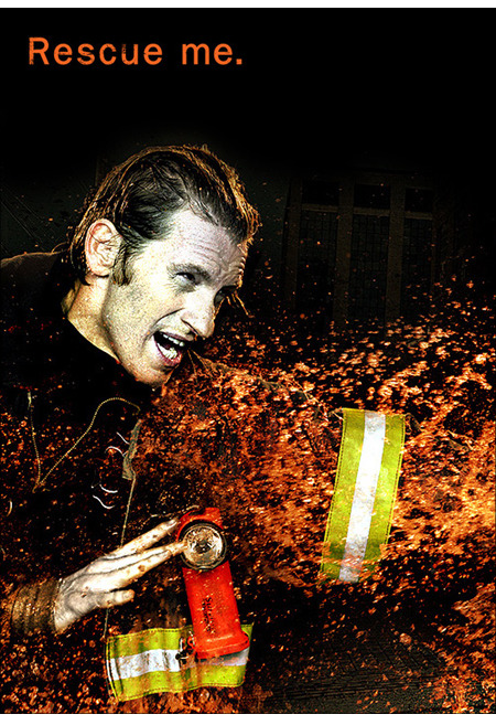
And on an entertainment note, is anyone else out there completely obsessed with how kick-ass Rescue Me is? I’ve been a Dennis Leary fan for years and his Fireman TV series is absolutely his best work and one of the best television series I have EVER seen.

Rescue me

If you have no idea what I’m talking about, Rescue me is an edgy adult TV series about the lives of various FNDY firefighters post 9/11 and how badly their lives have turned since that tragic day. It’s EXTREMELY gritty and isn’t carried on regular stations, it’s only on speciality stations like Fox’s action showcase channel. There’s loads of swearing, sexual content and has quite often had me in tears from laughing so hard. The 4th season JUST wrapped up and you can find the first 3 series on DVD all over the place. I HIGHLY recommend you check out this show, it’s every bit as good as reviewers say it is. I personally think television SUCKS and 99% of TV shows are absolute garbage, especially reality shows and all that nonsense. There’s only a couple of series I enjoy, like Third Watch (sucks it’s over), Prison Break (although that’s starting to get tedious now), but Rescue Me is probably the best thing since MacGyver!

You can also check out their official website at www.fxnetwork.com for showtimes and details about the production and cast.

The other day some P2L community members were talking about various ideas to boost the forum participation up and one of them jokingly poked a jab saying maybe we should start talking about version 5 of P2L, even though we just released v4. Well, I didn’t say anything he’d be surprised how close he came to the mark, because I am indeed already mulling over ideas and concepts for the 5th version of the site. There’s nothing SOLID down yet, but one of the things we are looking at is the possibility of a complete redesign and leaving behind the look we’ve more or less carried around since v2. This would be one of the biggest things we’ve done on the site actually as a new layout can be a make-it-or-break-it move. I’ve already been working with Nick and 2 other professional design groups, which will remain unnamed for the time being, on some concept designs, but I haven’t decided on anything yet. I just figured that being the guy that has designed everything on the site for the last 4 years, maybe it’s time we had a fresh set of eyes look at a design and freshen things up completely.

So nothing concrete on this yet, but I thought I’d mention it here for the few of you that read my blog, let alone read enough of this post to make it to this point.

So that’s about it for me… very busy on all kinds of projects and trying to have some fun in between. Take care gang and we’ll see you next post!

Dan

Mira Update, Techtuts is Up and v4 Release Follow-Up!

Mira Update, Techtuts is Up and v4 Release Follow-Up!

Hey gang!

Well it has been a CRAZY few weeks and I am well and truly exhausted but having some fun as well. My wife has recently returned to the work force, so I am back on full-time dad duty and won’t be around the PC as much until Corina is back in school. I’ll still be doing my P2L duties and running my shop at www.predatorstuff.com so no worries, I’m definitely around and up to no good!

Mira Foundation Update:

As you may have read previously, we recently became a sponsor family for a Mira puppy, which we keep for a year before he is given back to the foundation for formal training and finally, given to a blind or disabled person.
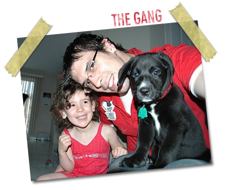
The Gang!

It’s been 3 weeks and the dog is quite clearly extremely intelligent, it took only 2 weeks to housebreak him and this is with zero crate training or paper/pad technique. So at 2 months old, Simba goes to the door when he needs to “leave presents”, obeys sit and lay down consistently and now we’re working on stay. It’s really quite remarkable how quickly he picks up on these training concepts and we’ve been practising some basic lead work with no choker and even that is already pretty advanced compared to other pups I’ve raised.

The most amusing thing with this guy is that he sleeps… CONSTANTLY! I know very young pups can sleep a good bit, but my last puppy, which was a German Shepherd, didn’t stop moving 24/7. Simba basically sleeps any time he can. In fact, when we go shopping at the mall and stop in a store to quickly browse a clothing rack, he’ll take the 10 seconds to lay down and promptly fall asleep. We took him to his first vaccination an group session yesterday and I had a chance to speak to some of the other owners and this seems to be consistent with all the other owners. Only 1 person said their dog was up constantly.

So at this point I am really happy with Simba, he’s an awesome dog and I’m having a blast! Corina is also getting over her huge fear of dogs and she doesn’t seem to be exhibiting any allergy symptoms so this is all working out quite well. For you single guys, you will be AMAZED at this four legged “babe magnet”. Seriously, I am swarmed by TONS of girls (and kids, senior citizens, adults etc etc) that want a chance to pet him, it’s a riot. Not that I’m saying you should do this for the sake of meeting people, but it’s just CRAZY the attention you get. We have to take him everywhere with us and all you hear are oohs and ahhs and cooing as you walk through the mall, it gets to the point that it’s almost embarrassing because you know everyone is looking at you and your dog. God help you if the dog has an accident in the mall, because you know all eyes are on your when it happens! But so far so good, and we’re having fun. Mira is very well known here in Montreal, so many people recognize the emblem he wears on his scarf and I’ve even had people shake my hand congratulating me on what we’re doing. It’s a great feeling and this is the stuff I will remember when it comes time to giving him back *dread* *dread*

So overall this has been a very pleasing experience so far and I truly love this dog and it’s really amazing to have a puppy around again. My daughter is just so proud of her “baby brother”, it’s awesome. We try to remind her that he’ll have to go next year, but I can already tell this will be a nightmare. Luckily we’ll be going to Disney World right after he goes back, so you can imagine that Disney + 5 year old = bliss. After maybe we’ll get our own dog to keep, although my wife isn’t very keen on having a dog permanently… we’ll have to work on her on that one 😉

Techtuts Launch

Just a heads up that Techtuts is back with a new upgrade and it looks great! This is a tutorial site coded by P2L staff member Adam and hes really quite proud of his new site, so wanted to share with everyone.

Techtuts!

There’s a whole bunch of new features, including a new User Control Panel, new Tutorial system and a whole bunch more. You can read the official release notice here on their forums. Congrats Adam, it looks awesome!

Pixel2life v4 Follow-Up:

Well it’s been almost a week since we launched the new version of Pixel2life and it has been a huge success and people definitely love the new changes. There are of course some folks that don’t like certain elements, but that’s to be expected as you can’t lease everyone, especially when you have 30,000 people visiting your site daily. The majority seem pleased, so that’s all you can really hope for. Heck if I listened to the haters, we’d still be on v1 lol! But on a serious note, I still read all the comments be it good or bad and I will address any of the negative points if possible. Obviously things like “Wah everything sucks, where mommy?” type comments can’t really be acted upon as they’re completely useless, but things like people asking that ads be more distinctive so they can be more easily identified among the content will definitely be looked at. We’ve also had some people mentions issues with the dropdown category browser dropping too far off the page, so we’ll be addressing these issues.

Trust me, I value EVERYONE’S opinions, as long as they are constructive and not idiotic ramblings that are from people complaining for the sake of complaining. If there’s anything I’ve learned both from running a large site and working in corporate environments, it’s that people detest change. This is natural and even people that claim they love change really don’t… it’s like saying “I think out of the box”, when you clearly don’t and just do your job and want your pay check at the end of the day. So it’s natural for most people to not like something fairly different, so I tend to get the better comments after folks have had a couple of weeks to use the new system and can offer their thoughts without a gag reflex getting in the way from change-up overload.

Either way, I am REALLY pleased and proud of this release, and Nick, Jamie and Adam all did a kick ass job of putting this together from my design mockups and worked with me all hours to finish this up. Nice going guys, hats off to your hard work! For the the rest of the community, I hope you enjoy the new changes and enjoy what we have coming up in the near future.

Thanks for reading and remember you can post comments using the form below!

Dan