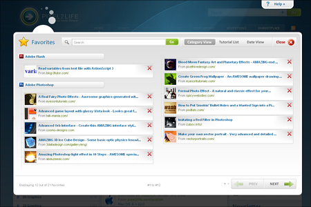
v5 Update – New Faves Interface for Easy Access
It’s a feature we introduced in the main v3 update (if I remember right) but I wasn’t a fan of it’s accessibility and the new update is a perfect chance to rethink the implementation of tutorial favorites.

Spring break is upon us and I know Nick is very hard at work trying to get as much done on v5 as possible before the hectic school schedule hits at full force again next week. Hopefully we can polish off the Publishing System and a few other loose ends and then finish up the newsletter and other bits. So yeah, I’m hounding him constantly and I need to start working on the new documentation and write-ups all this stuff is going to need.
Tonight I wanted to talk a little bit about the Faves system, which is the integrated bookmarking system allowing members to flag specific tutorials as “Faves” (favorites) and then easily call them up as needed. This was a long requested feature by MANY users who wanted an easy way to tag tutorials they would like to easily find later down the road, and with 22,171 current faves on the site, the system was obviously a welcomed addition. Despite it’s success, I always felt it was a bit clunky to use… marking tutorials as faves was easy enough, it was a single click on the faves icon. But recalling your faves list would force you to leave whatever page or search you were currently doing, and for those of you that had large fave lists, you had no way to really sort or search your faves.
Those days are OVA!

The new faves listing can now be called up with a single click without having to load a new page or leaving/screwing up your current search or form you were in the middle of filling out etc. The Faves list loads right on top of whatever you are working on for a quick glance with full paging, various sorting tools (you can sort by category, title or date) and even a built in keyword search for you fave addicts! Once you’re finished, click the close button and you’re right back to whatever page you were working on when you first accessed your faves list. And adding tutorials to your faves list is as easy as always, simply click the faves check-mark icon and it’s done!
So hope you guys dig the new faves setup. Before I click on spellcheck and then the publish button, I wanted to quickly touch on a great suggestion provided by Barry in the comments of my last P2L v5 Update post, where he suggests the following:
Just a quick idea. Have you thought about a has your tutorial been added to our tutorial index before feature? I’m not sure this would really be needed but it may reduce duplicate entries or 400 tutorials on how to make the date display on a page with php.
This is actually a fantastic suggestion that I have had in the back of my mind for a long time and will be something I bring up with Nick as a post-update release on the site. Currently the only duplicate checking we do on tutorials is URL based because of people resubmitting declined tutorials over and over again. I think having something that says “Hey we found tutorials with similar keywords in the title, is this a dupe?” would be a great idea, so thanks and we’ll definitely look in to that.
That’s it for me gang, have a great spring break! (yes I know some of you don’t start until next week or possibly the week after… consider this advanced well wishes) Please be sure to chare your comments by clicking on the comment button below, just try to keep it on topic *cough* Matt *cough*
Take care,
Dan
2 thoughts on “v5 Update – New Faves Interface for Easy Access”
Dan… it looks as if its coming along nicely. I seem to only come by Pixel2Life these days to submit tutorials and leave, but with this new design and update I may just stick around like I used to. Keep up the good work, and can’t wait for this update to be released! You should probably hint at a time frame you would like it to be released by
Cool, hope you stick around more often then