Brushed Steel Interface with Glass Button in Photopaint v12
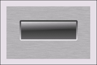
Well the Corel tutorial section is looking a little quiet, so I figured I’d better start adding some meat to the bones 🙂 As some of you know, I like to “translate” Photoshop tutorials for the Photopaint people, and I usually do tutorials based on effects that P2L visitors request from me directly. In the last month or so, I’ve received a few requests on how to draw those metallica interfaces with the plastic or glass buttons. So in this latest tutorial, I’ve combined two pupular effects to generate a glass button set into a brushed steel interface background.
Here is the final product we’re going to create:
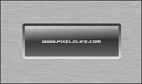
As you can tell, it’s fairly basic, but this will give you the foundation to produce more complex peices. Feel free to experiment with the various settings as you go to produce different effects.
Step 1:
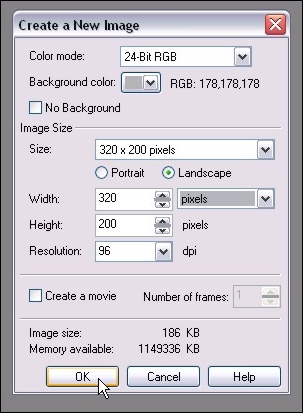
We start of by creating a new document. Now bear in mind that when we use this method, the brushed steel will end up being the background. If you decide that you want the background to become another layer, you can do so at anytime by clicking on Object > Create > From Background. Here are the settings I used for this tutorial:
Step 2:
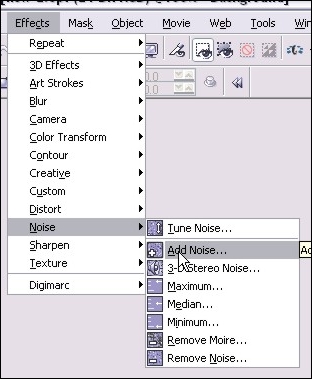
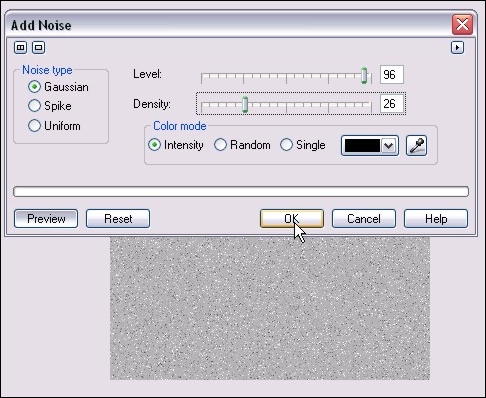
We’ll start off by adding some noise to the background. When we distort the noise, that will create the brushed look we want. So we run the filter by clicking on Effects > Noise > Add Noise.
Here are the settings I used (NOTE: If you increase the density, the darker your “brushed” look will become. These settings will keep the look fairly light):
Step 3:
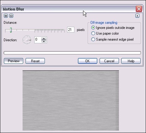
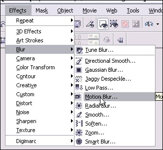
Next we’ll add a motion blur to create the brushed look of our steel. You run that filter by clicking on Effects > Blur > Motion Blur
Here are the settings I used:
Step 4:
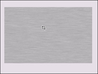
After you’re applied the motion blur, you’re going to have uneven shading on the edges (As you can see in the preview pic in step 3). We’ll get rid of the by cropping the image so we only have the even area left. Hit D for the crop tool and select the area you want to keep. Release the mouse button and double click inside the area you want, and that will crop out the outside area. You’ll end up with this:
Step 6:
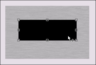
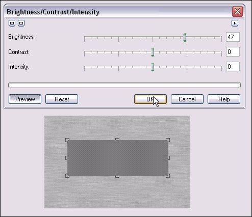
Now hit ctrl-c then ctrl-v (Copy and Paste) to create a second black square over the first one. We’ll adjust the brightness a bit to add some flavor to our button. Click on Image > Adjust > Brightness/Contrast/Intensity and use these settings to brighten up that second box a bit:
Step 7:
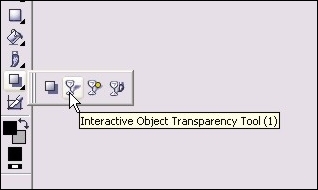
Now we’ll start adding some gradient type effects with one of my favorite tools, the Interactive Object Transparency Tool, which you can activate by hitting 1, or from your main toolbar:
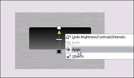
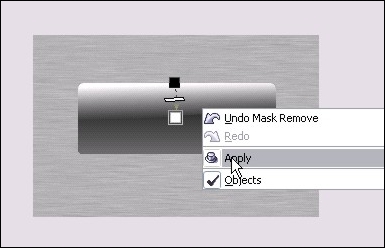
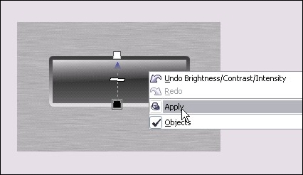
Here’s how to use it: Put your mouse pointer at the bottom of the rectangle and click and hold the left mouse button. Move your mouse tot he top of the rectangle and release it. You can now see we’ve created a gradient type transaprency. Right click on the rectangle and click apply. Here’s how it looks once you’ve right clicked to apply the transaprency:
Step 8:
Next we’ll create the “shine” of the glass. Hit ctrl-v and once again you’ll have another black rectangle over your button. Repeat the brightness step in Step 6, except increase the brightness 100% so that your rectangle is now white. You’ll end up with this:
Step 9:
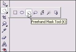
We’ll need to cut that white square a bit to give that nice classic glass shine effect, so from your main toolbar, select the Freehand Mask Tool or simply hit K:
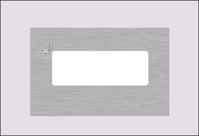
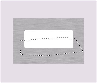
Now starting on the left side of the white square, click the left ouse button to activate the mask. Move your mouse to the right and click again to activate a mask point. Keep moving to form a rough rectangle around the botom half of the rectangle, and click once each time you change direction. Double-click to finish the mask and you’ll end up with this:
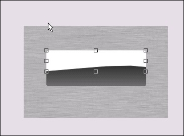
Hit the delete key and the section you masked off will be cut away and look like this:
Step 10:
Once again grab your Interactive Object Transparency Tool and repeat step 7 for the white half rectangle, except start from top to bottom rather than bottom to top. You’ll end up with this:
Step 11:
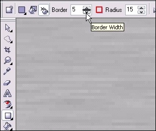
Now we’ll add a border to the glass button to give that inset effect. Select the rectangle tool again and you should still have the settings from when you created the initial black square. In the settings for the rectangle tool, turn outline on and turn fill off. Change the border setting to 5 pixels. Be sure to select a dark outline color (I used dark grey) Here’s a shot of the rectangle settings I used:
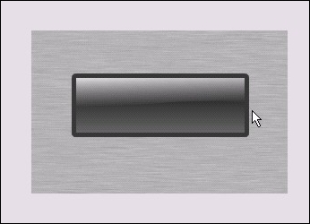
Now zoom in to your current button and draw a new rectangle over top, exactly the same size. The curved corners should line up exactly the same and you’ll end up with this:
Step 12:
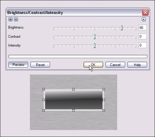
Once your rectangle outline is done, do another copy/paste (ctrl-c and ctrl-v) to create a duplicate copy. Once again adjust the brightness for the second outline following the steps in step 6. Here are the brightness settings I used:
Step 13:
Again we use the Interactive Object Transparency Tool and repeat step 7 to fade the two outlines together. Here’s how it should look:
Step 14:
As the dust settles… your project at this point should look something like this:
Step 15:
Add some text and other details (Shadows, additional shine etc…) and you’re done!
Please post any questions or comments on this tutorial 🙂
Dan

One thought on “Brushed Steel Interface with Glass Button in Photopaint v12”
dud!! your awesome!! thank for your tutorials i learn a lot it solve my prob(i;m a student of art) for 2 weeks i’m browsing the net and i came across your site and it really help me!!! wow people like is a master of digital arts and effects. hope you have more articles to help people like me thank you very much!!!!