Converting a color photo to a scratchy black and white or sepia in Corel Photopaint!
Why hello there boys and girls, I hope everyone has been behaving themselves seeing as it’s been MONTHS since I’ve been able to sit down and throw together a tutorial for you. I apologize for the huge absence, but as most of you probably know, I have been going through some fairly massive life-changes so things have been a wee bit hectic. BUT I am happy to say that things are calming down and my work routine should be coming back to normal. With that said, here’s a small tutorial I wrote today based on a request from one of my Facebook friends asking about a photo I posted from my recent trip to Cuba.
If you’ve never been to Cuba or seen photos from other friends and whatnot, Cuba is basically frozen in time with LOADS of items such as cars, furniture, tools and much more from the 40s, 50s and 60s. In fact, you will see perhaps 4 cars from the 1950s for each car you see manufactured in the last 10 years or so… needless to say, this is heaven for a classic car lover like me! While walking around one of the markets, my girlfriend snapped a shot of me standing next to a 1955 Chevy and we both noticed that this pic could easily be an original black and white from the 50s. So, I promised her I would make it look like an old photo for our album and I posted it on FB for my friends to check out. Here’s how I did it in about 5 minutes.
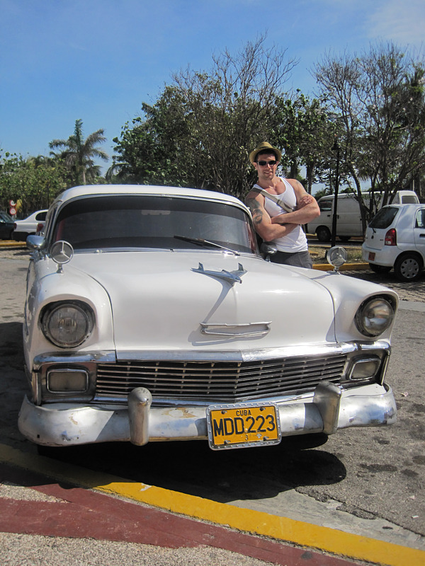
Here’s the original photo we’re going to start with:
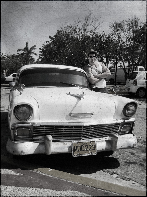
And here’s what we’re going to end up with at the end of the tutorial:
Before we get too far in to it, I’m going to assume you are now familiar working in Corel Photopaint. If you’re not sure how to use Objects and other basic functions, please check out my older tutorials, which cover the basics in greater detail.
Step 1 – First thing we need to do is create a duplicate layer of the photo… so just do a simple copy/paste and duplicate the layer.
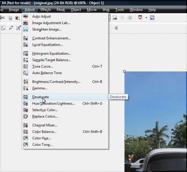
Step 2 – Click on the new object layer and desaturate the layer… you do this by clicking on Adjust > Desaturate. Your photo will now appear in greyscale.
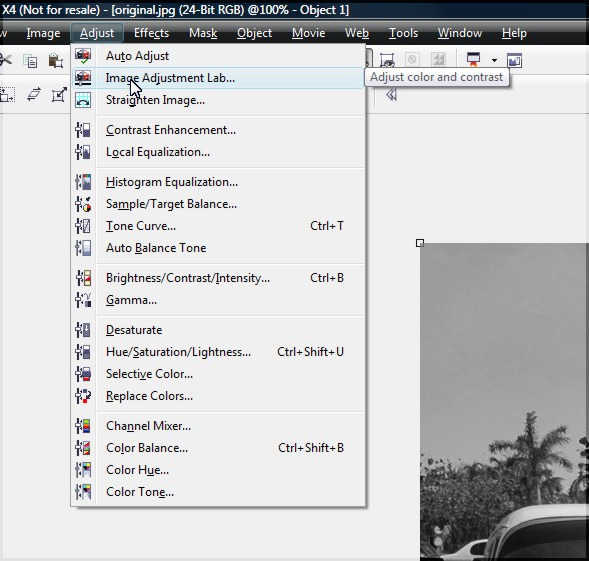
Step 3 – After running the desaturate function, the photo will be stripped of the depth the color gives it, making the photo appear a bit bland and lacking highlights and shadows. We’re going to punch this up a bit by playing with the contrast. In my older tutorials, I used to use the contrast/brightness/intensity function, but I have lately been using the more powerful Image Adjustment Lab, which you can access by clicking on Adjust > Image Adjustment Lab.
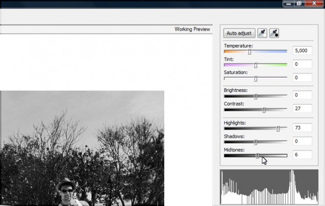
Step 4 – The Image Adjustment Lab allows you to controla variety of adjustments you can perform on the photo, including the saturation, overall brightness and contrast, as well as boost highlights, shadows and midtones. First thing I like to do is pump up the contrast, then I adjust the highlights and midtones to a level that appeals to me. You can see the adjustments I made below:
Once you’re happy with the look of your photo, click OK to apply the changes and return to the main edito screen.
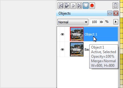
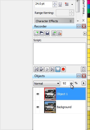
Step 5 – Before we merge the object layer with the background layer, there’s one more little trick I like to do, and that’s add just a pinch of color to the photo… you want just a little smidge though, something barely noticeable. You do this easily by simply reducing the opacity by a fraction on the main object layer. I dial it down to 92% for the level I like:
At this point, we no longer need to keep the layers seperate, so go ahead and merge them and we’ll move on to the next step.
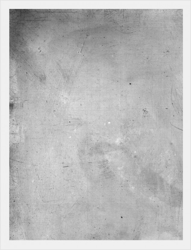
Step 6 – Time to mess up our photo and give it some age. I quickly did an image search for scratched photo textures and found this beauty by Jeremy Brotherton on his Deviant Art page (click here). Just paste this right on top of the photo.
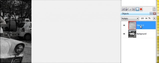
Step 7 – After you’ve slapped a texture on top of your photo, set the object layer type to “multiply” and you’ll start to see the magic happening! Of course we’ll need to adjust the texture a bit, so let’s tweak it to where we want it to be…
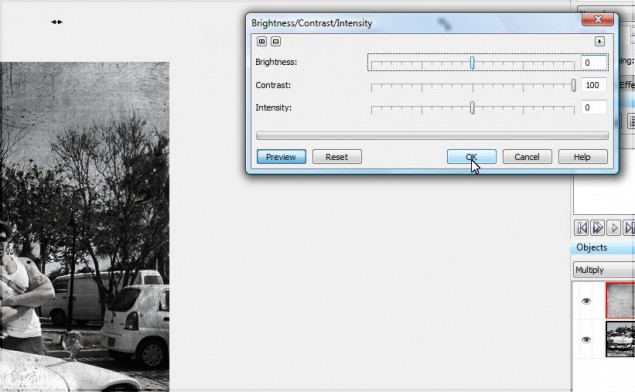
I want to pump up the highlights of the texture so it doesn’t darken the photo up too much. We can do this easily by pumping the contrast up to the max:
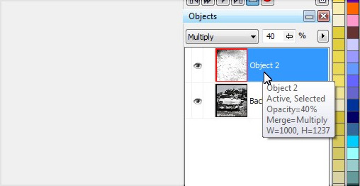
The texture will still be a little too intense, so I tone that down by reducing the opacity to 40% or so. The texture looks good, but it’s not quite scratchy enough for me, so we’ll build that effect up a bit more.
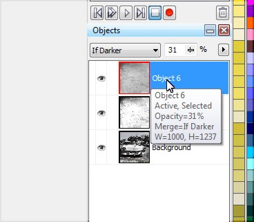
Step 8 – I want more scratches in the photo, so paste another layer of the texture and set that layer to “If Darker” and reduce opacity to 30ish% and the scratches should now look pretty convincing and realistic.
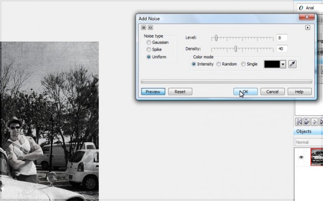
Step 9 – One more step… the photo looks great, but it’s a little too clear for an old photo. We can dirty up slightly by adding a tiny bit of noise. Hit the noise filter by clicking on Effects > Noise > Add Noise.
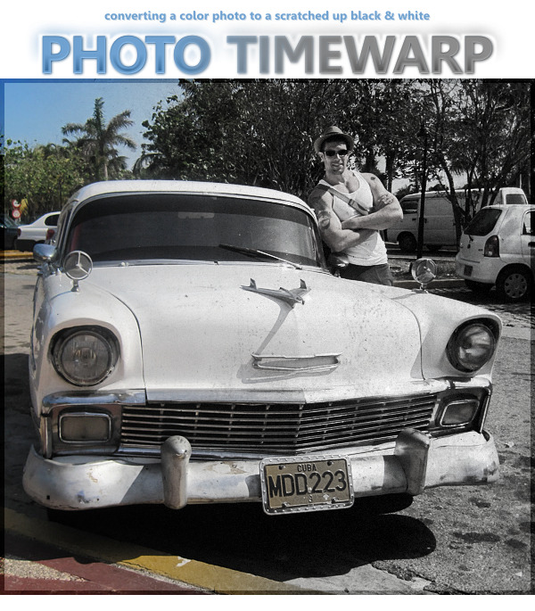
And we’re done! Here’s our final result straight out of the 50s and ready for your album:
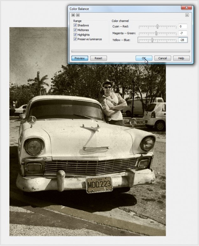
Would you prefer Sepia? Adding a Sepia effect to this end result is one step away, and VERY easy. Just click on Adjust > Color Balance and tweak the yellow and magenta sliders like so:
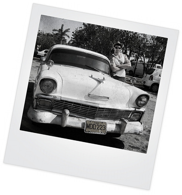
You can also drop the photo in to a Polaroid template (There are dozens of these available on Deviant Art):
Thanks for reading, please make sure to share this tutorial or comment using the tools below!
Dan

2 thoughts on “Converting a color photo to a scratchy black and white or sepia in Corel Photopaint!”
Nice tricks! Thank you for this tutorial.
Thank you!